Sanoy - 2024
(En)
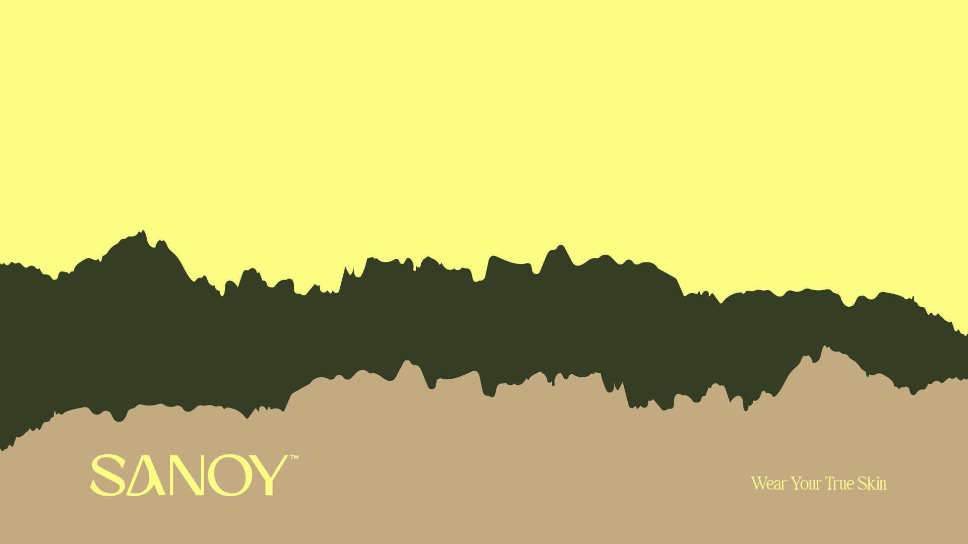
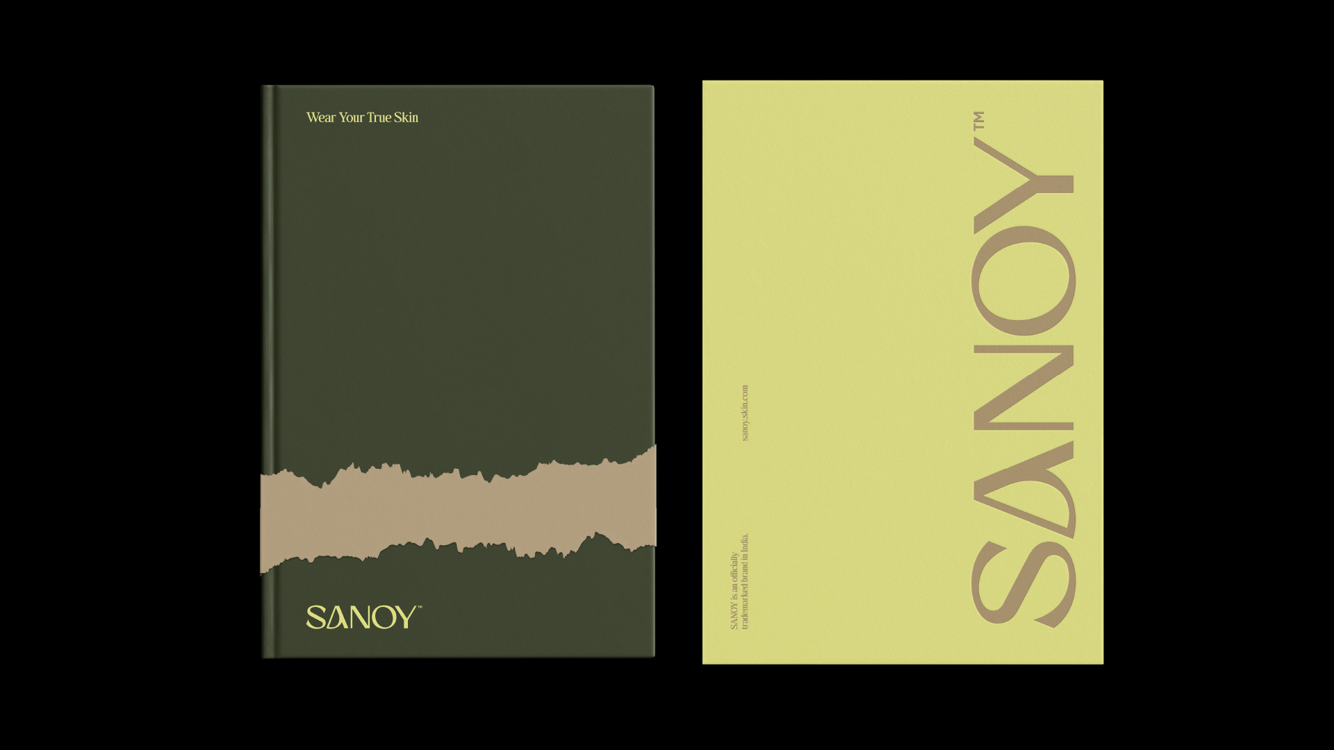
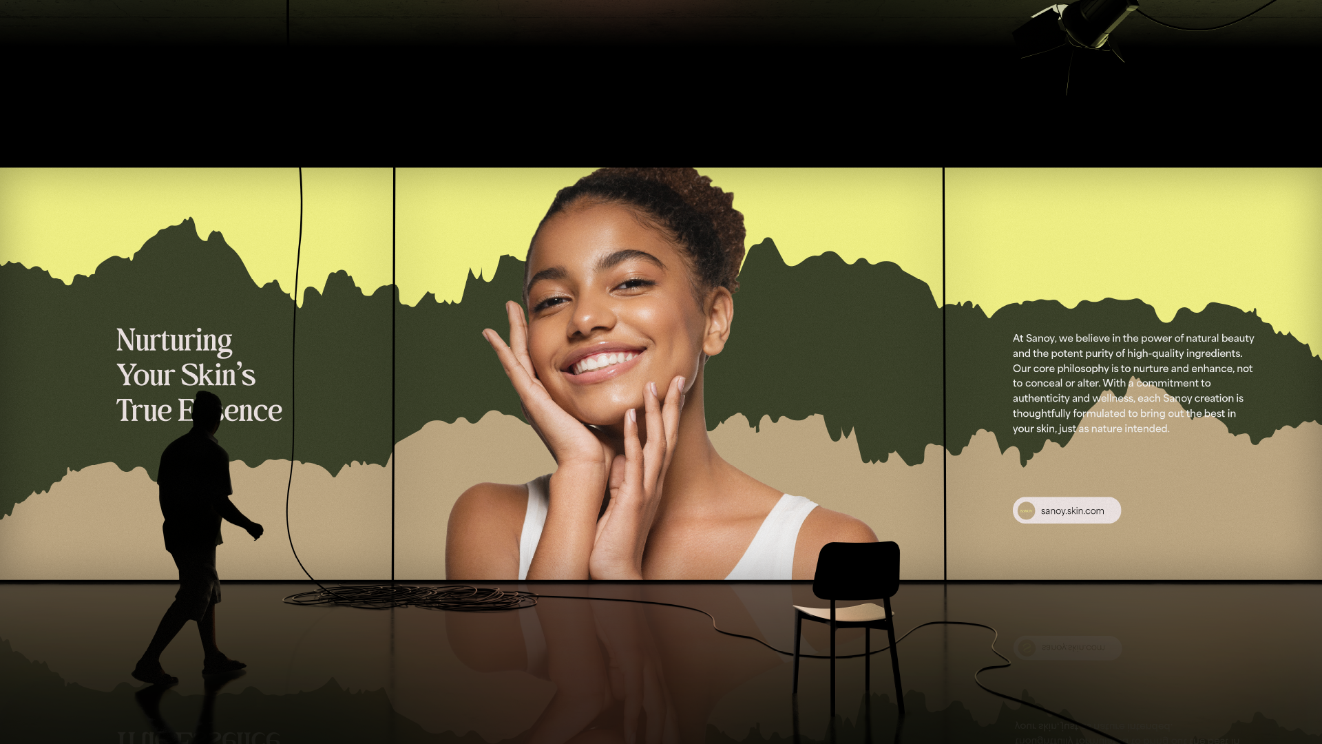
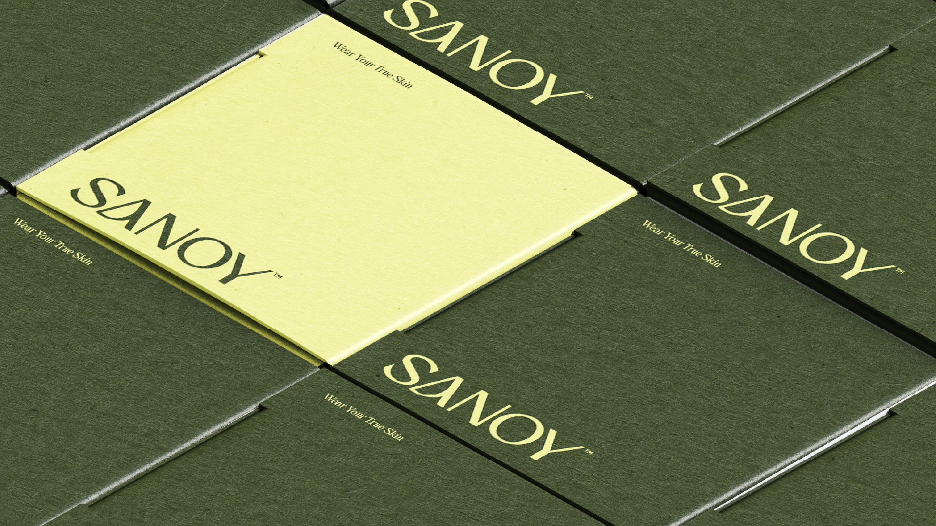
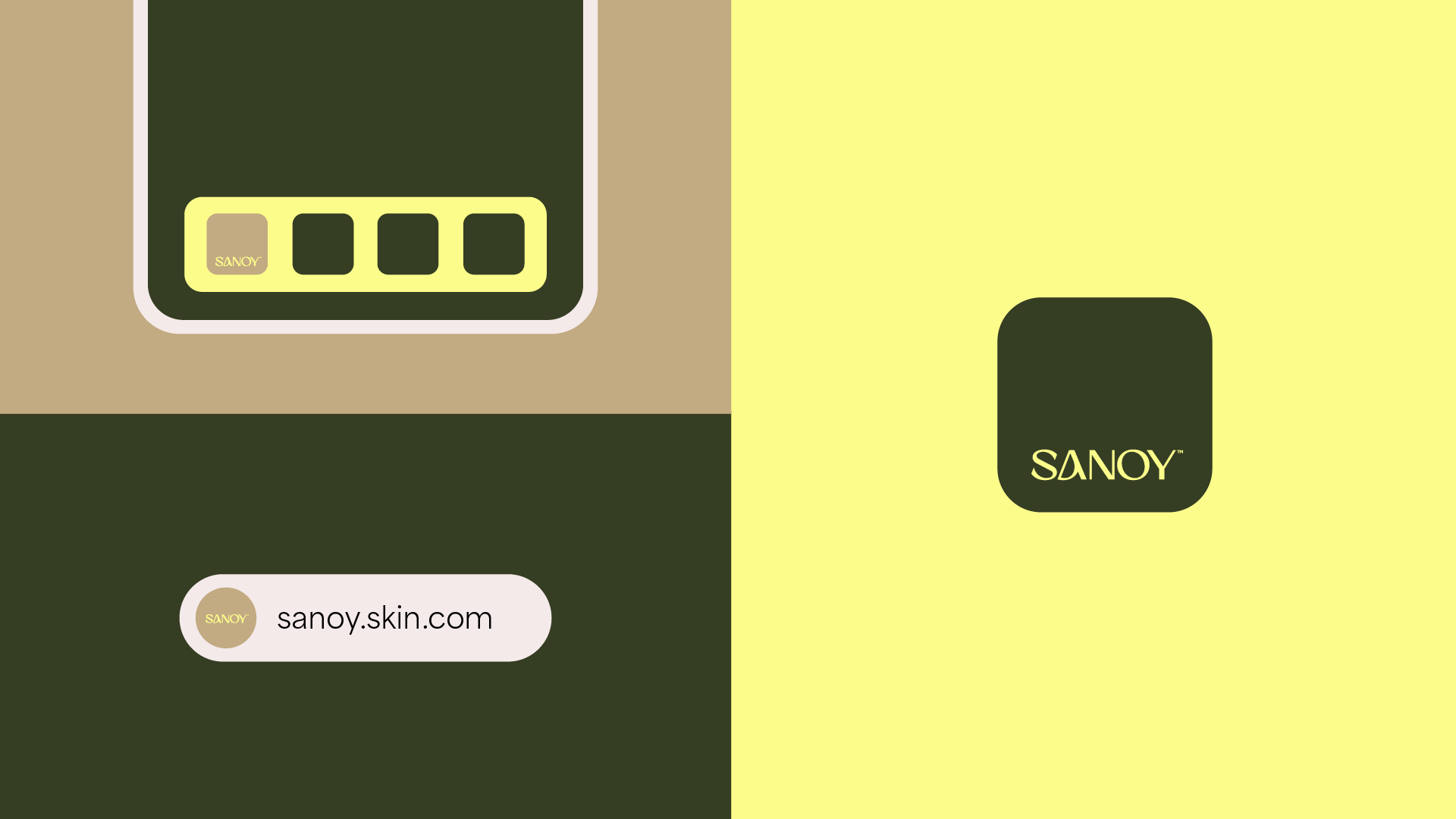
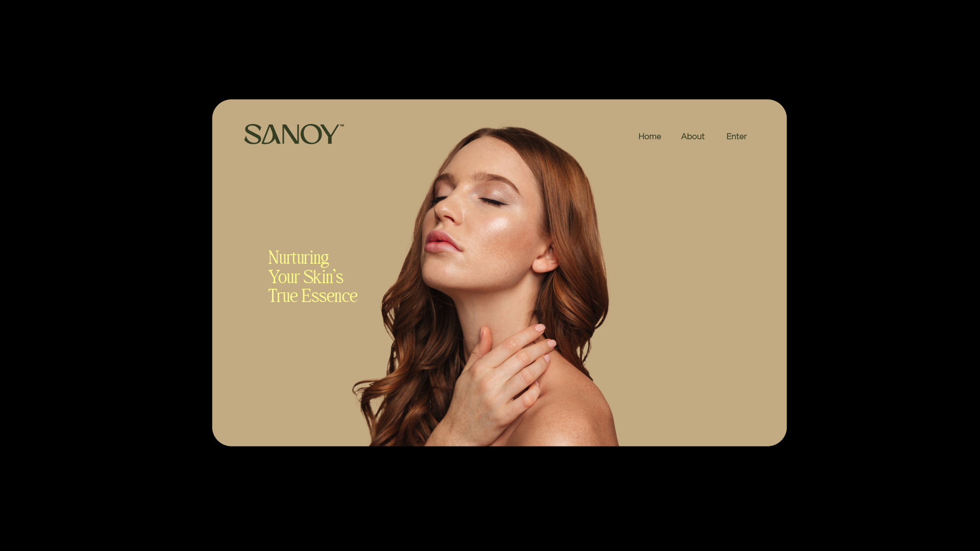
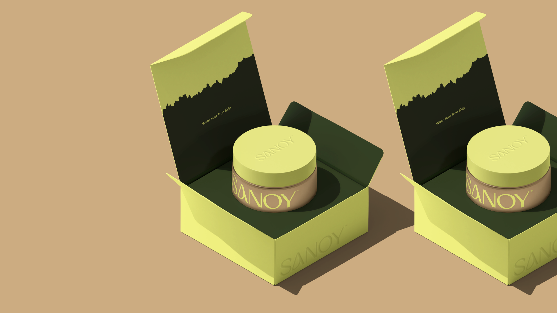
Our brand concept is inspired by the harmony and purity of nature. We seek to capture the invigorating essence of a lush garden, where each product is an authentic expression of natural beauty. Our colors reflect the freshness and vitality of plants, while the graphics evoke the organic texture of the earth and the fluidity of natural elements. Each irregular detail is a tribute to the diversity and uniqueness of nature, reflecting our commitment to authenticity and simplicity. The result is a sensory experience that invites our customers to reconnect with their own essence, finding beauty in the simplicity and purity of natural ingredients.
(Pt)
O conceito da nossa marca inspira-se na harmonia e na pureza da natureza. Procuramos captar a essência revigorante de um jardim exuberante, onde cada produto é uma expressão autêntica da beleza natural. As nossas cores reflectem a frescura e a vitalidade das plantas, enquanto os grafismos evocam a textura orgânica da terra e a fluidez dos elementos naturais. Cada detalhe irregular é um tributo à diversidade e à singularidade da natureza, reflectindo o nosso compromisso com a autenticidade e a simplicidade. O resultado é uma experiência sensorial que convida os nossos clientes a reconectarem-se com a sua própria essência, encontrando beleza na simplicidade e pureza dos ingredientes naturais.
(En)
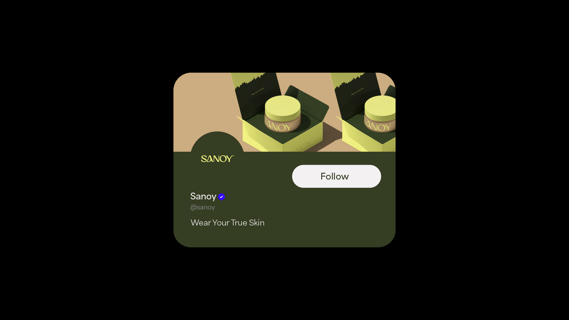
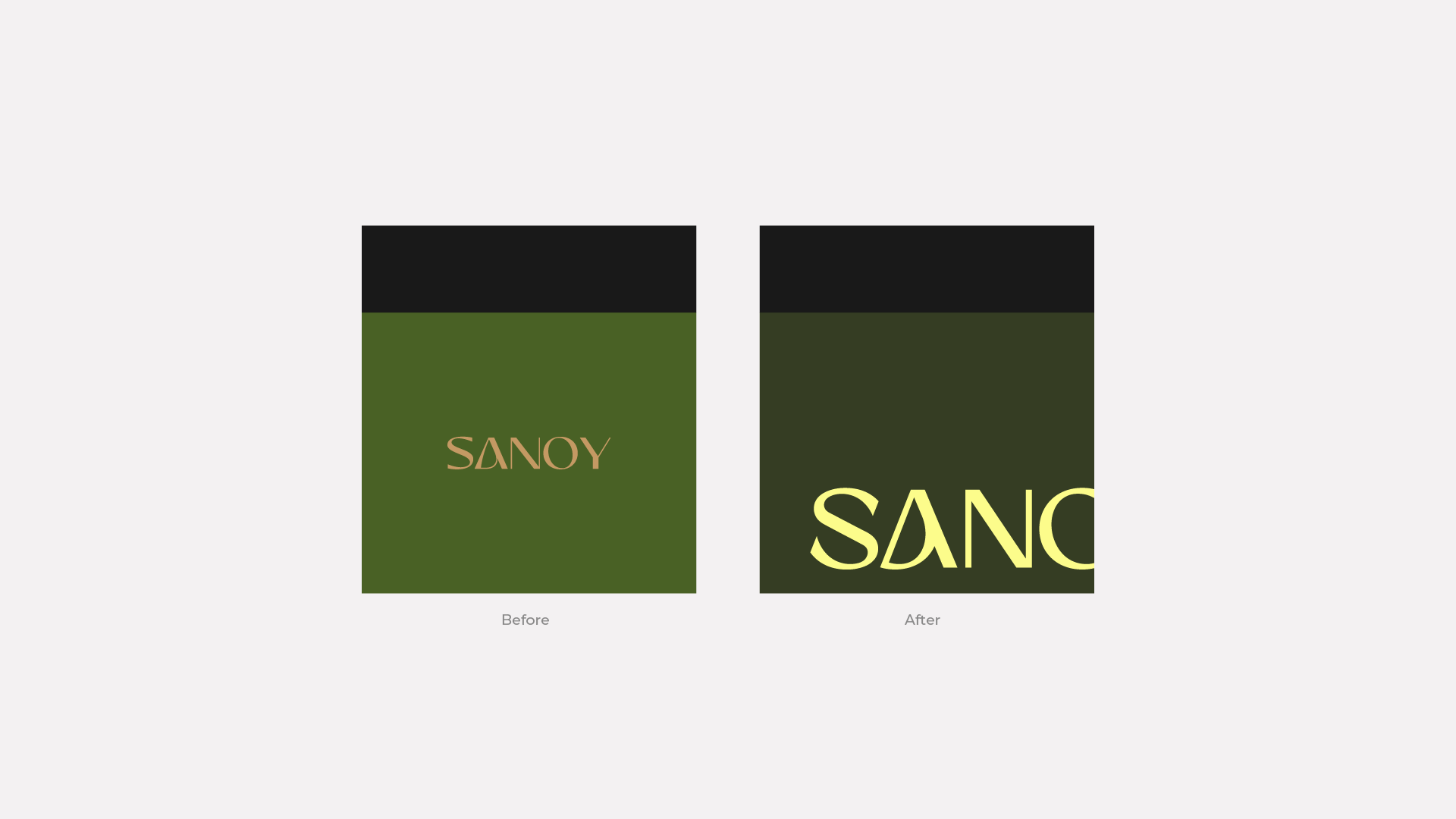
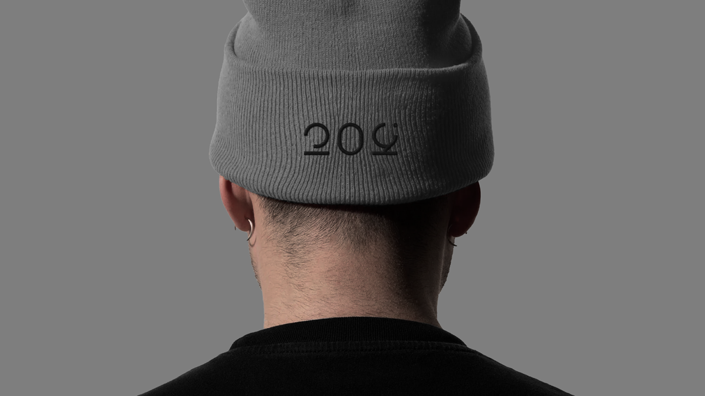
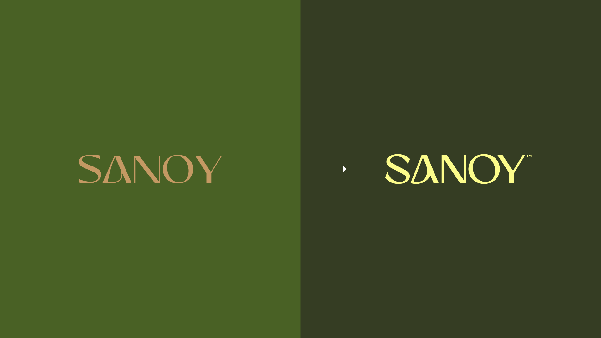
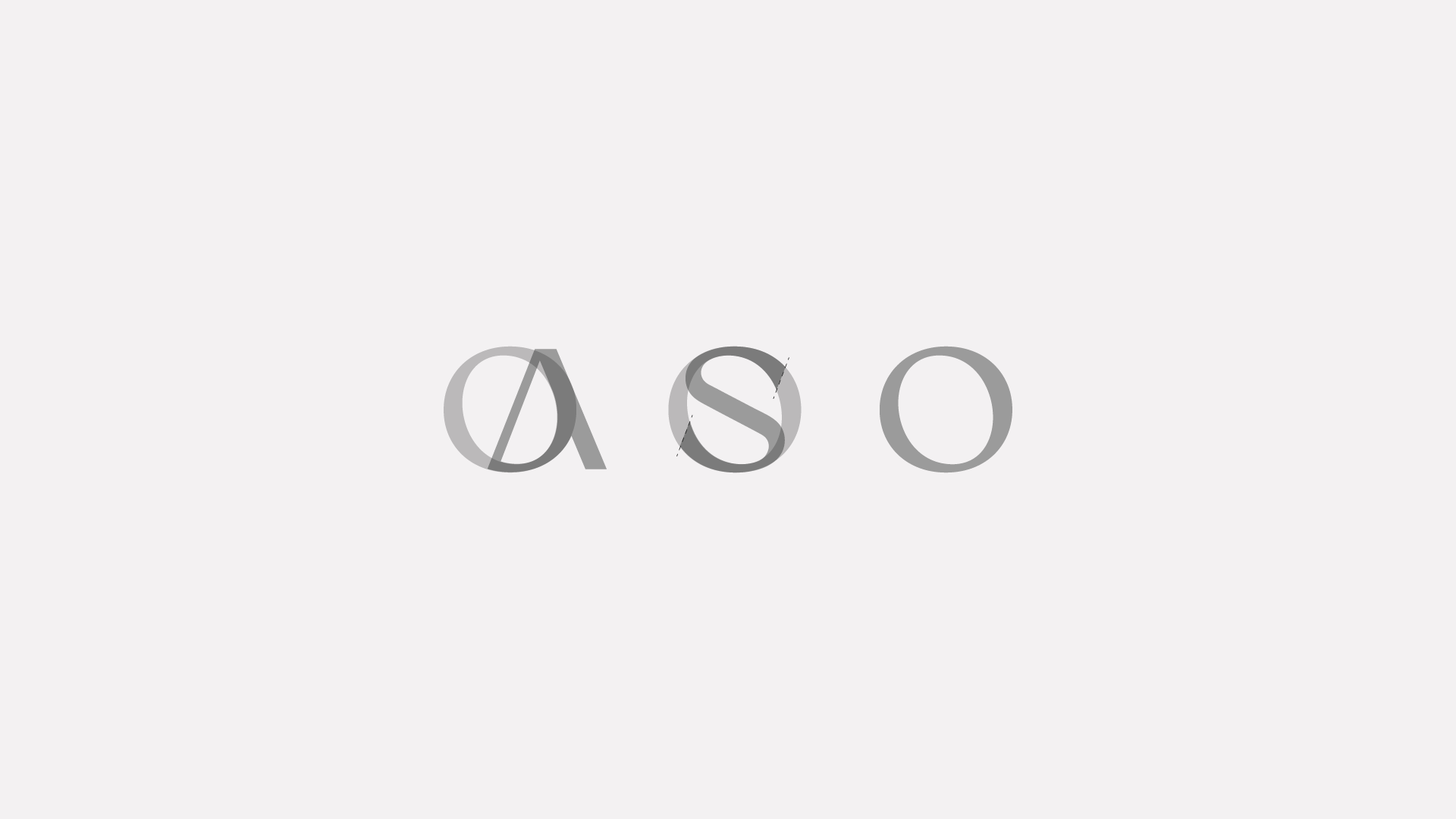
We worked on a redesign of the font, focussing on adjustments linked to a more technical direction and improving its applicability and flexibility. In addition, these adjustments will increase the brand's originality.The previous font had a disproportion between the thinner and thicker parts of the typeface, which caused problems when reducing the brand, where some parts disappeared long before others. In order to improve this, we also adjusted the spaces between the fonts, making optical adjustments so that we have visual harmony in the brand. In the previous font, letters such as "Y" and "S" seemed to be misaligned and with larger spaces between them.Another detail we focussed on was the size of the letters, using a grid and following it to work on all the letters in the font. The main and most impactful point was the use of the letter "O" as the basis for the development of two other letters, such as "S" and "A". This will bring originality to the brand, which is now not just typed, but carefully made for the Sanoy brand.
(Pt)
Trabalhamos em um redesenho da fonte, concentrando-nos em ajustes ligados a uma direção mais técnica e melhorando sua aplicabilidade e flexibilidade. A fonte anterior apresentava uma desproporção entre as partes mais finas e mais grossas do tipo de letra, o que causava problemas na redução da marca, em que algumas partes desapareciam muito antes de outras. Para melhorar isso, também ajustamos os espaços entre as fontes, fazendo ajustes ópticos para que tenhamos harmonia visual na marca. Na fonte anterior, letras como “Y” e “S” pareciam estar desalinhadas e com espaços maiores entre elas. Outro detalhe que focamos foi o tamanho das letras, utilizando uma grade e seguindo-a para trabalhar todas as letras da fonte. O ponto principal e mais impactante foi o uso da letra “O” como base para o desenvolvimento de duas outras letras, como “S” e “A”. Isso trará originalidade à marca, que agora não é apenas digitada, mas cuidadosamente criada para a marca Sanoy.