
SOLV - 2024
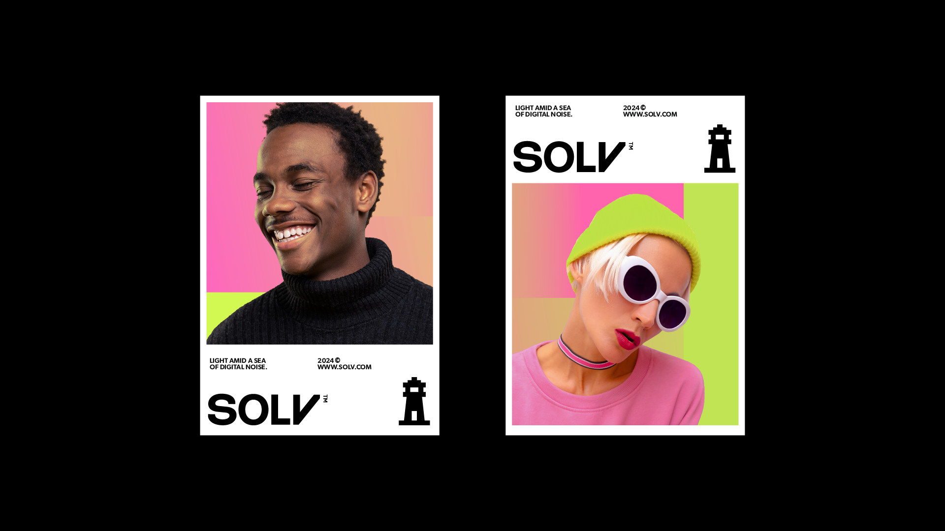
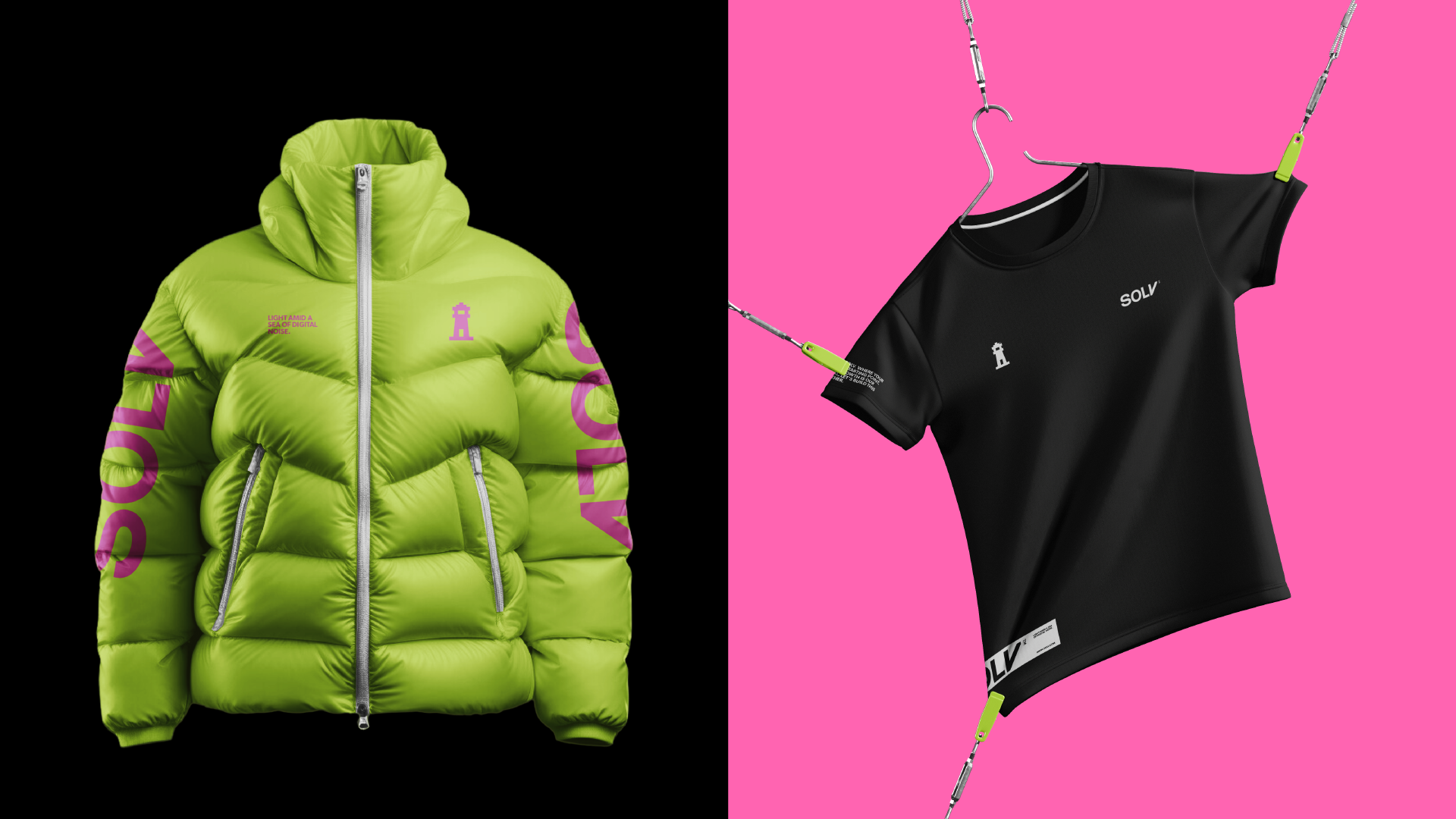
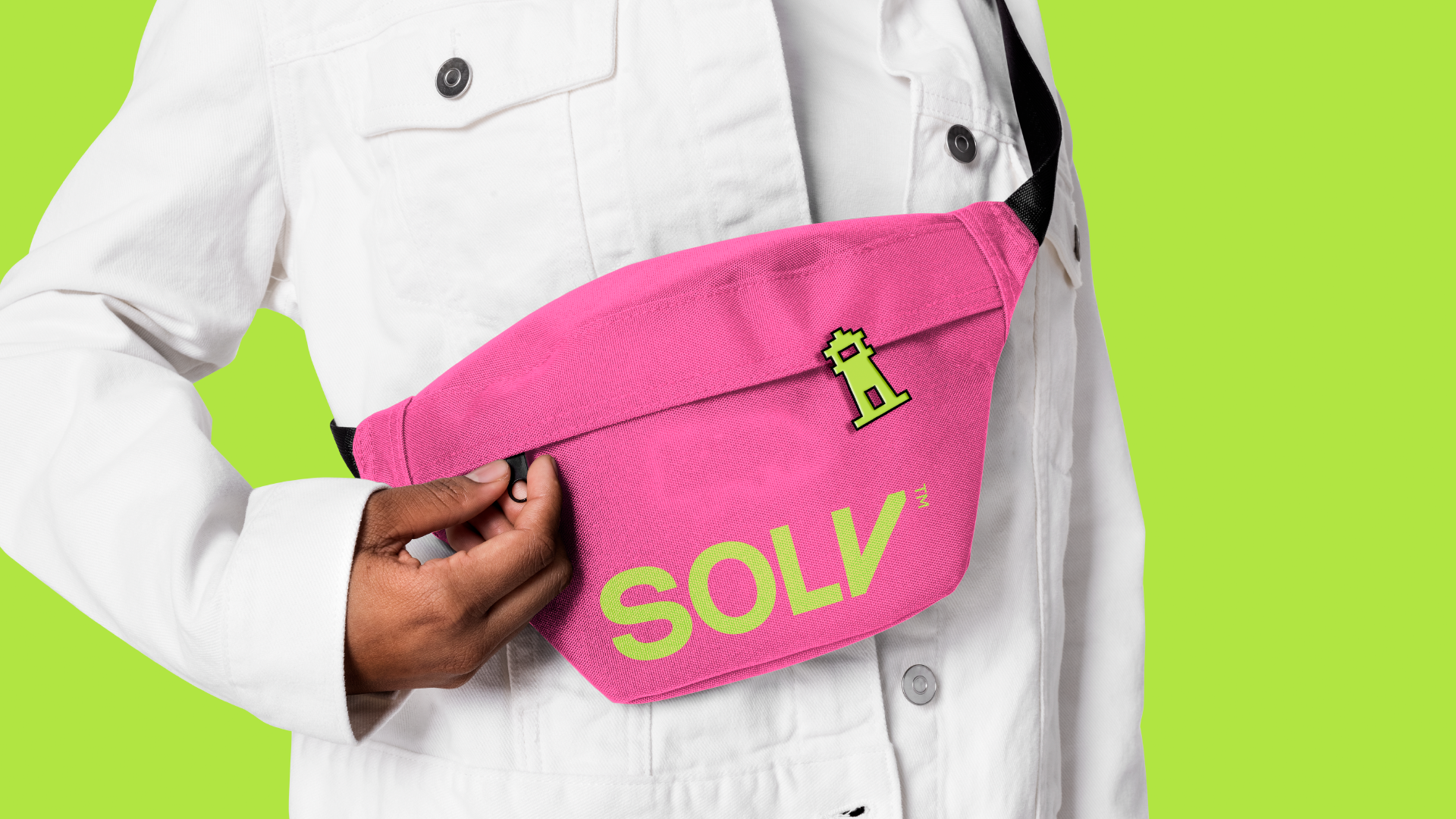
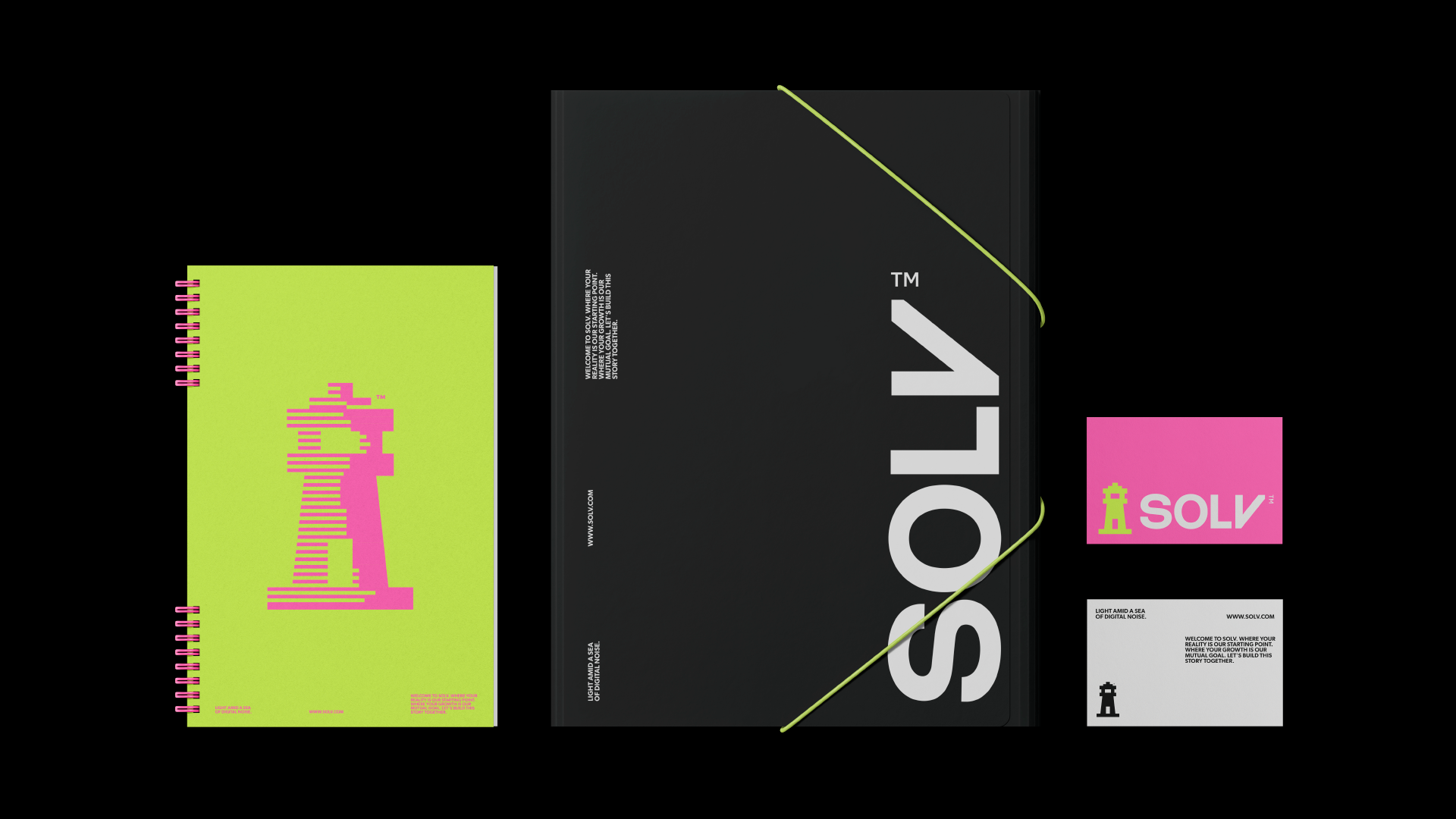
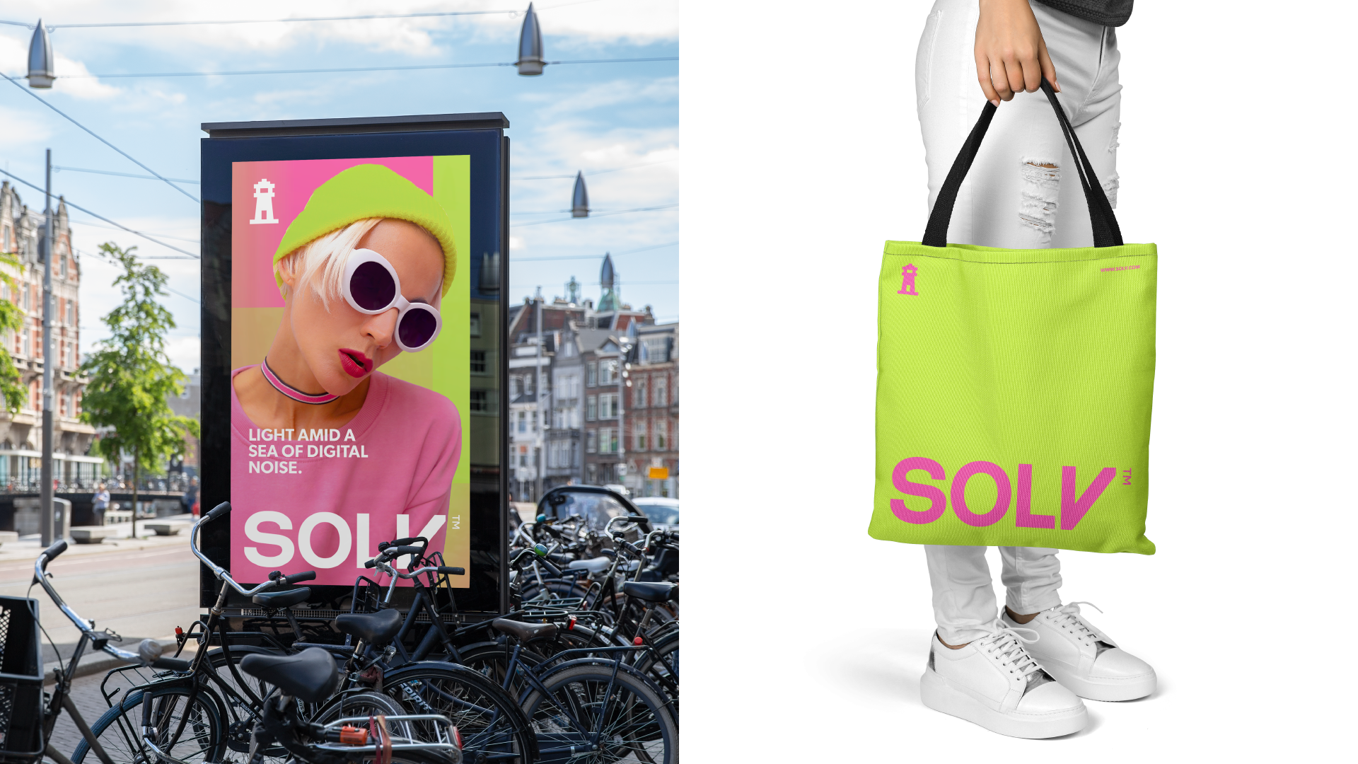
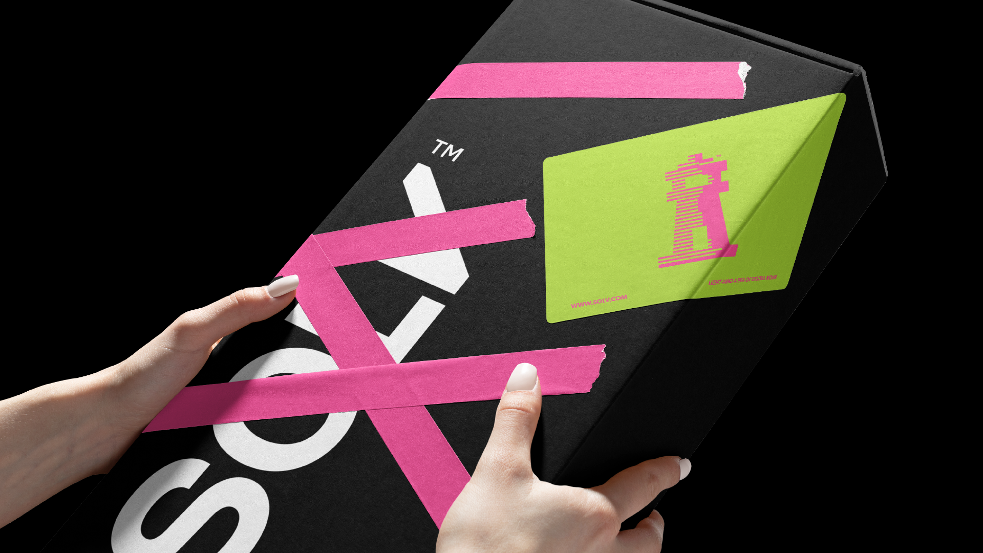
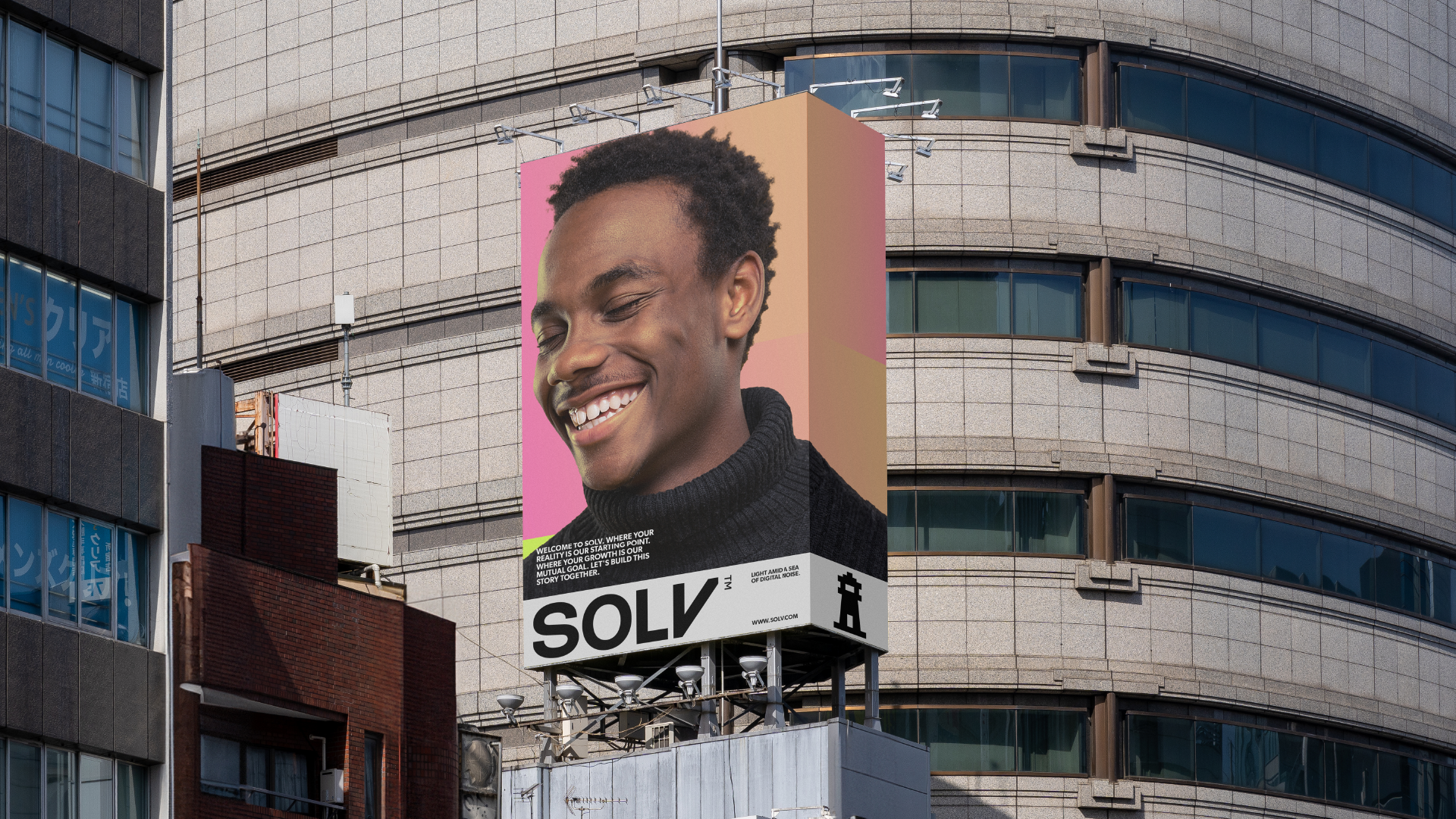
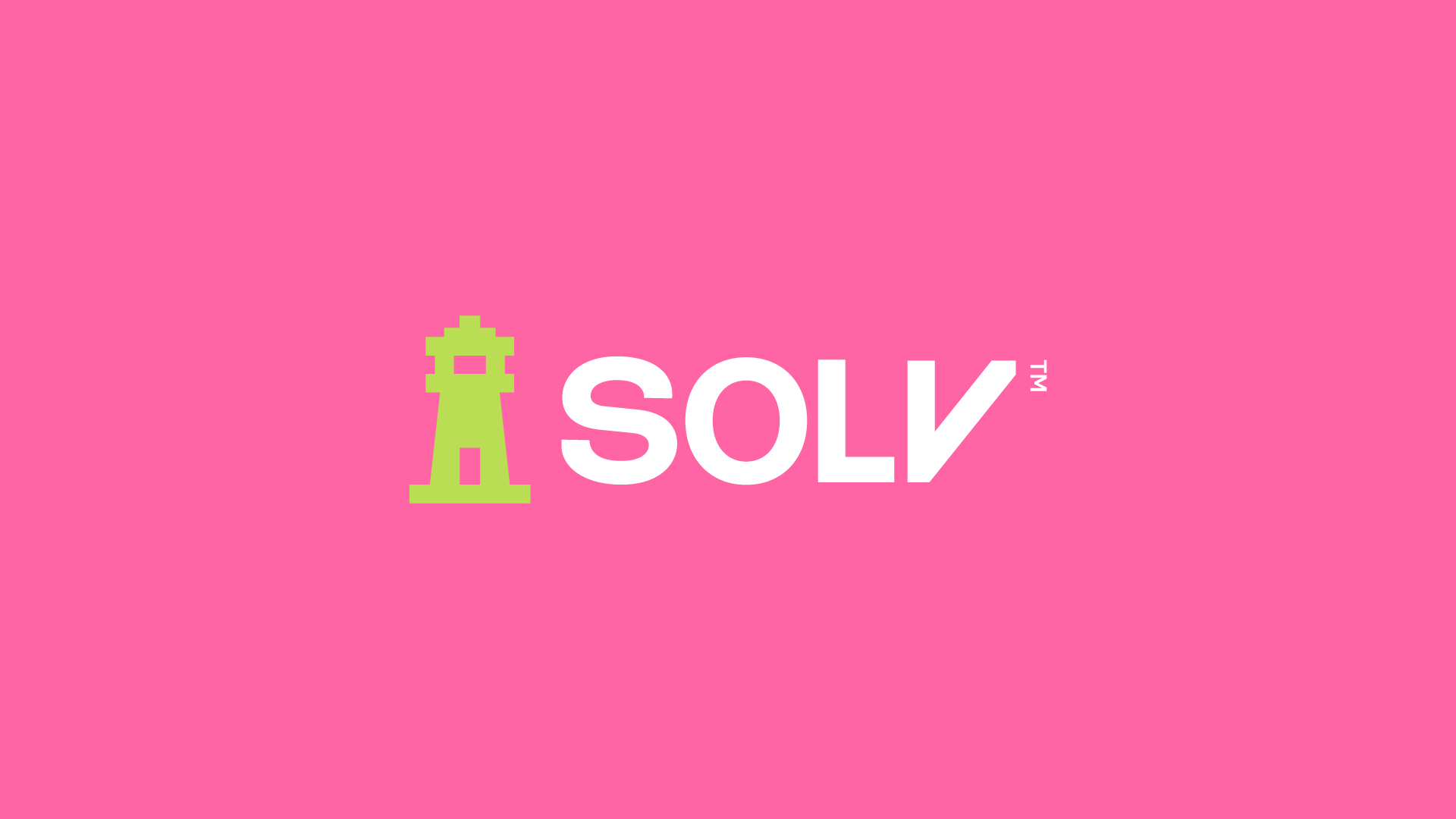
The Solv project was carefully developed to encapsulate its fundamental principles of clarity, reliability and humanization. Inspired by the concept of the lighthouse, the branding conveys the brand's mission to be a guiding light in the midst of digital noise. The visual identity, centered on a lighthouse icon, reflects the promise of providing solid solutions and tangible results, while reinforcing the security and trust that the brand wishes to inspire in its clients.
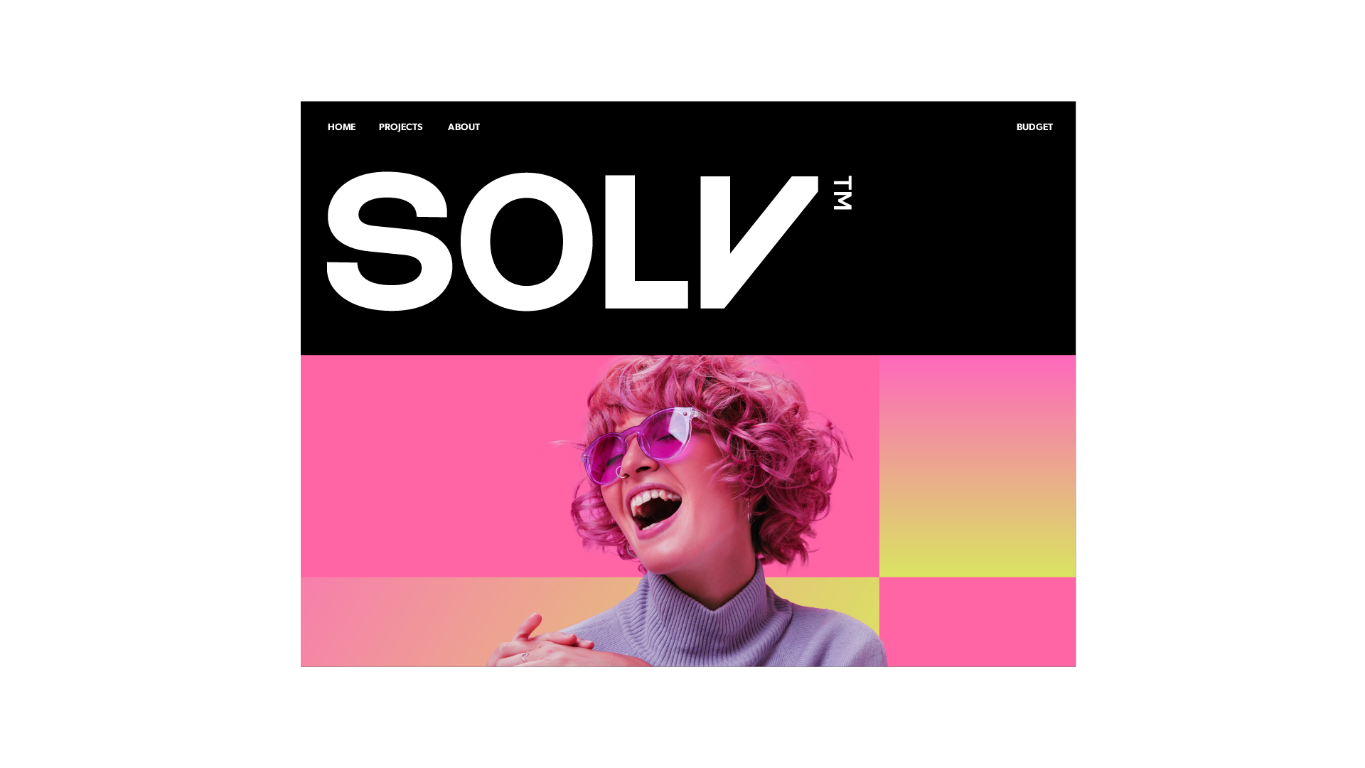
Every element of the branding, from the color palette to the typography, was chosen to communicate a sense of approachable professionalism and modernity. The brand narrative focuses on a close and human approach, highlighting the commitment to understanding and meeting clients' needs in a personalized way.
-
O projeto da Solv foi cuidadosamente desenvolvido para encapsular seus princípios fundamentais de clareza, confiabilidade e humanização. Inspirado pelo conceito do farol, o branding transmite a missão da marca de ser uma luz guia em meio ao ruído digital. A identidade visual, centrada em um ícone de farol, reflete a promessa de fornecer soluções sólidas e resultados tangíveis, enquanto reforça a segurança e a confiança que a marca deseja inspirar em seus clientes.
Cada elemento do branding, desde a paleta de cores até a tipografia, foi escolhido para comunicar uma sensação de profissionalismo acessível e modernidade. A narrativa da marca foca em uma abordagem próxima e humana, destacando o compromisso de entender e atender às necessidades dos clientes de maneira personalizada.

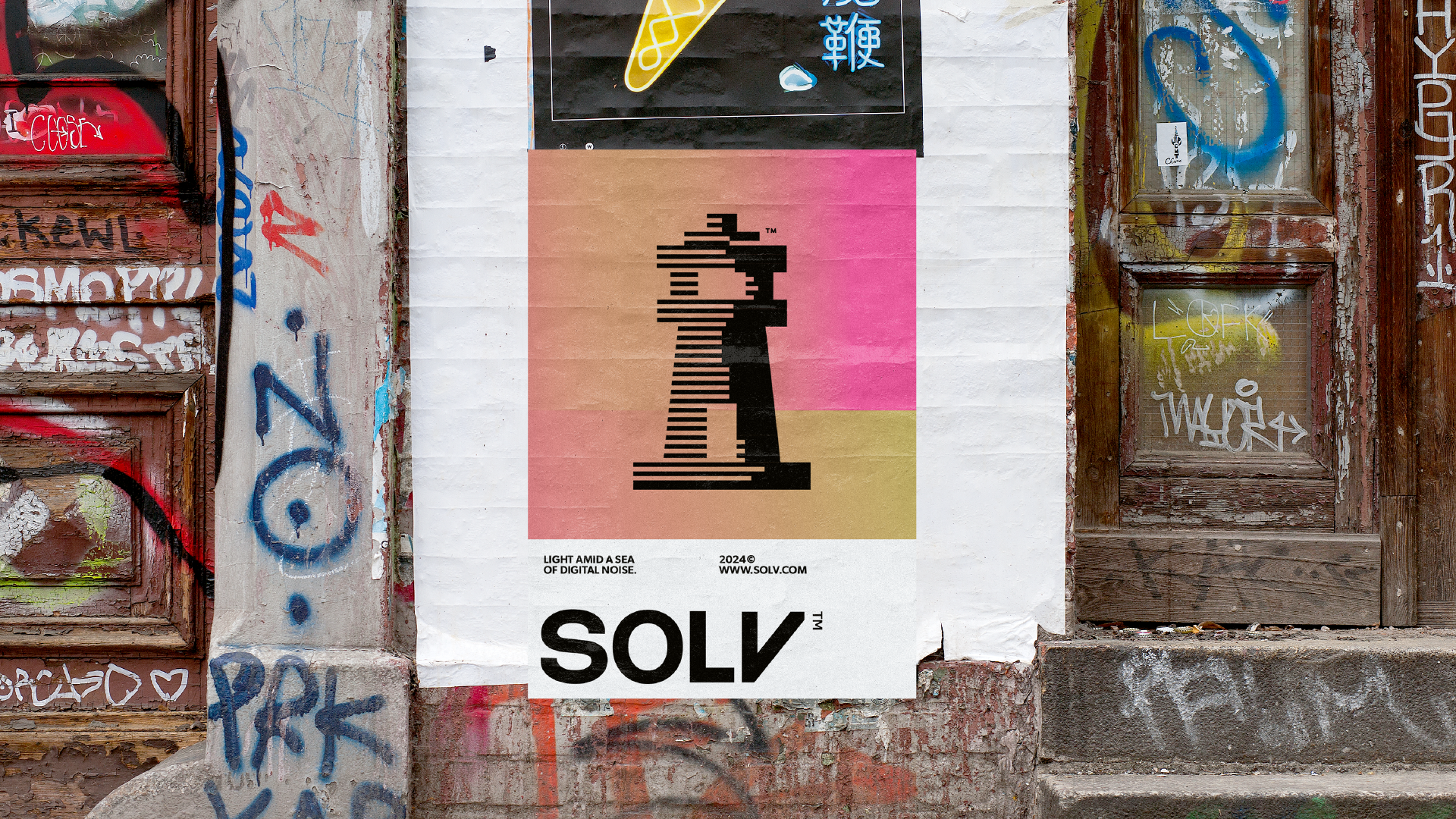
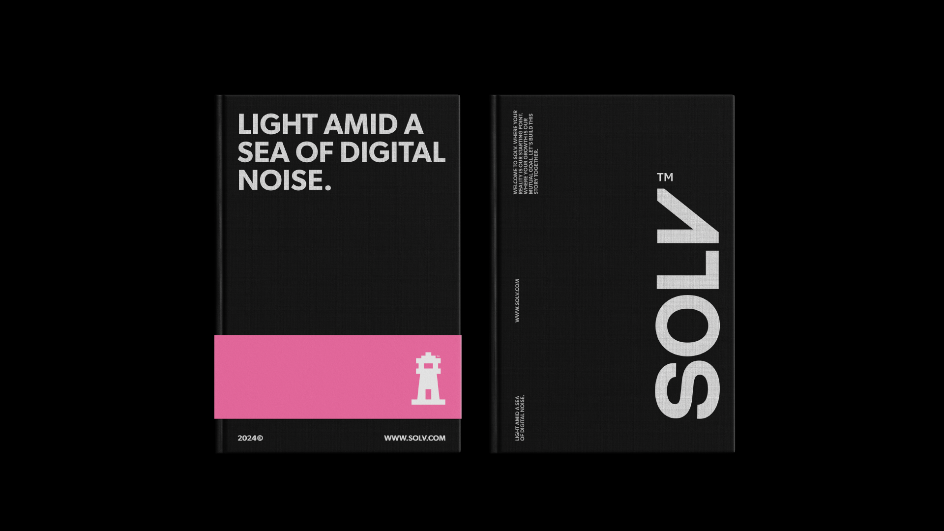
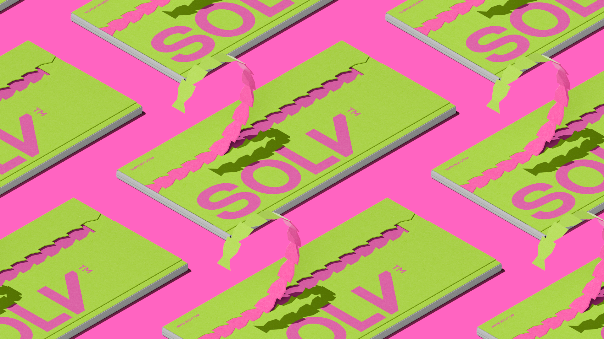
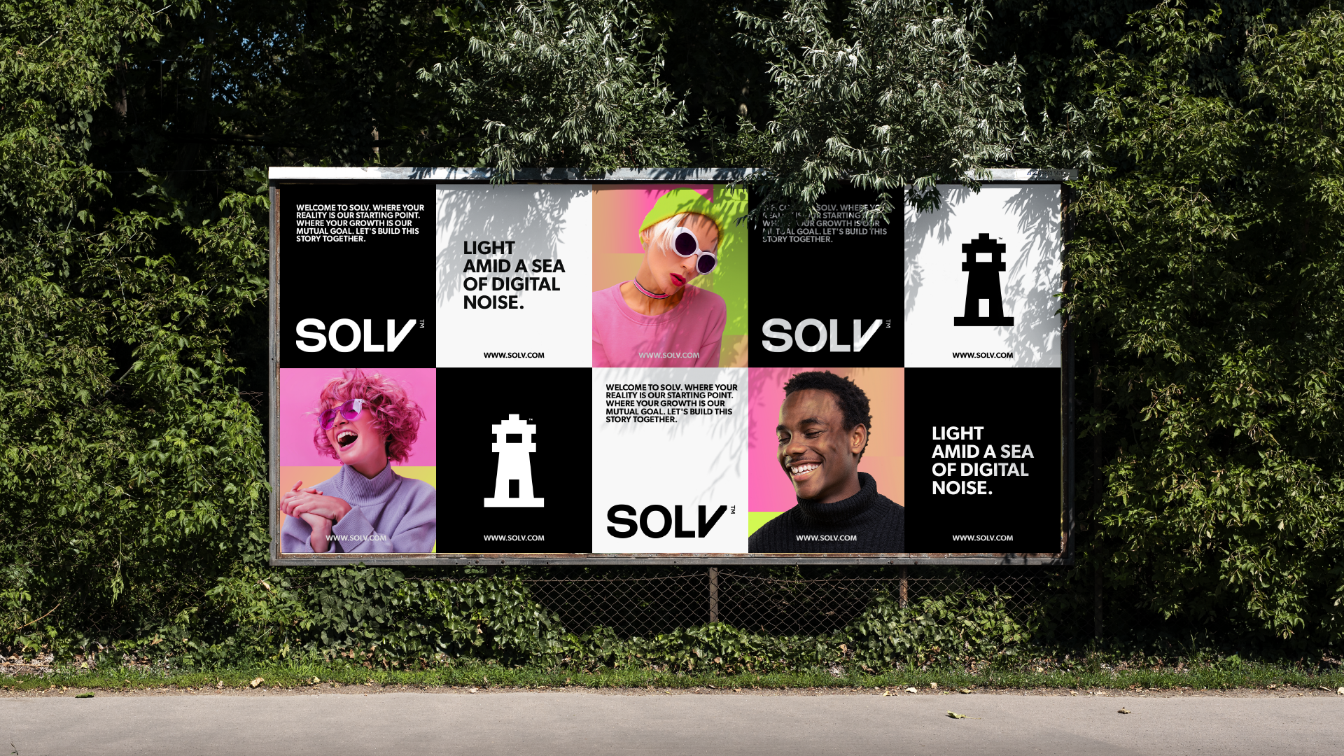
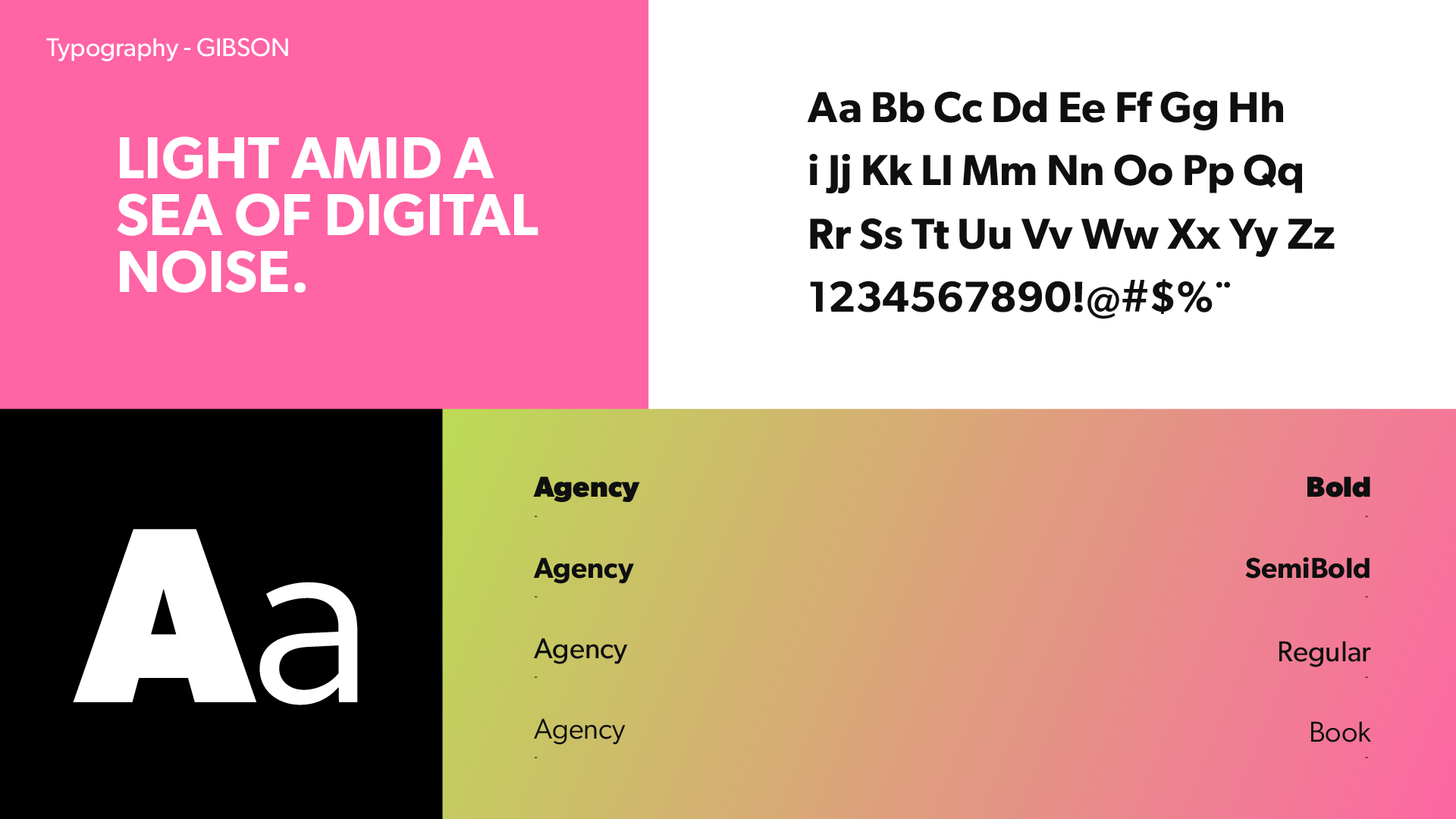
LIGHT AMID A SEA OF DIGITAL NOISE.
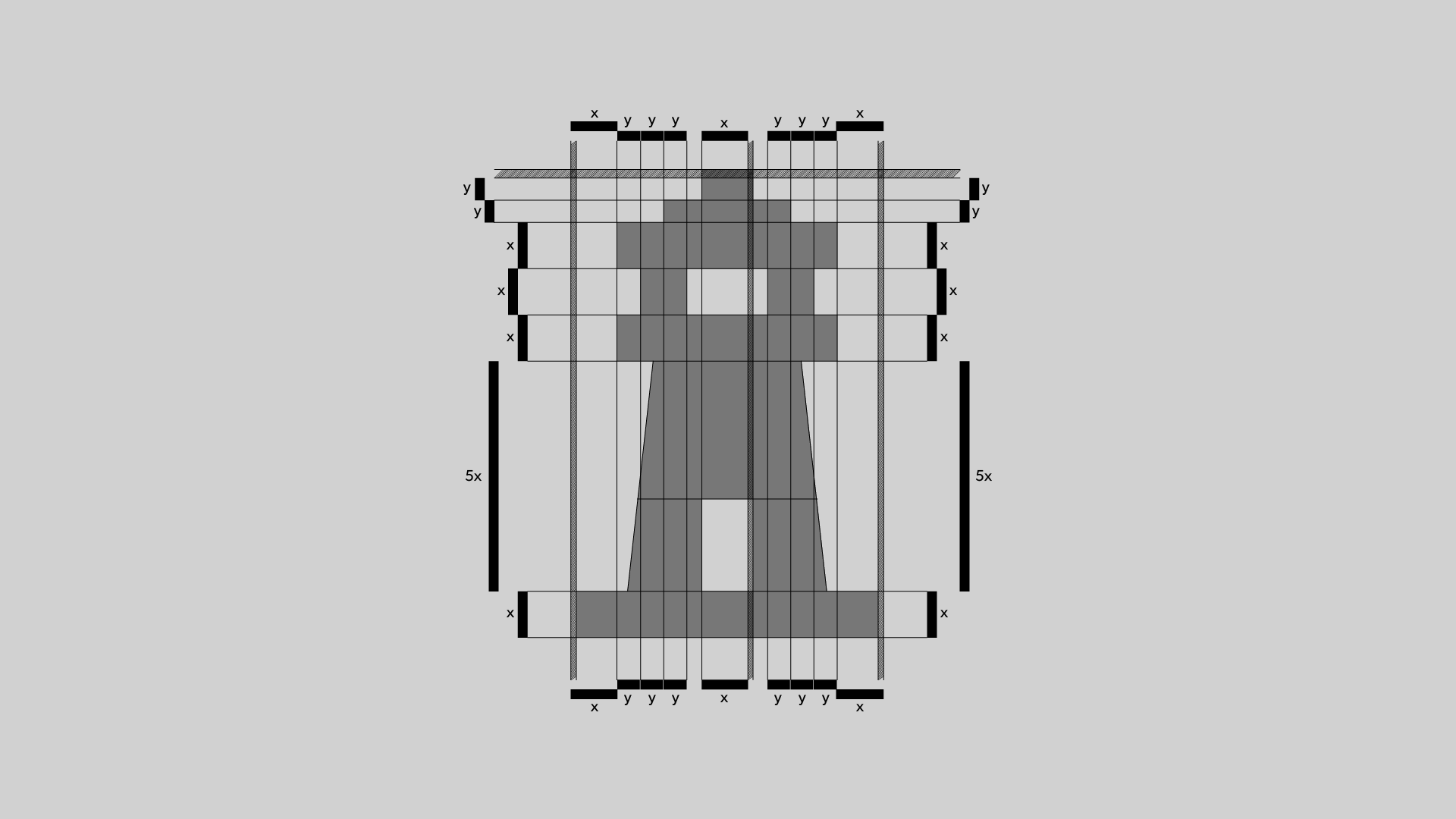
The use of the lighthouse as an icon is deeply rooted in the fundamental principles and concepts of our brand. By adopting the lighthouse as a symbol, we sought to convey the idea of being a reliable source of guidance and clarity amidst the vast ocean of digital noise. This choice was not just aesthetic; it was a strategic decision that reflects our mission and values.
Our aim is to be more than just a company or service; we aspire to be a beacon of solutions in a world awash with complexity and uncertainty. We want to be recognized as a solid and reliable source of light, capable of guiding our clients through the challenges and difficulties they face.
In addition, the lighthouse symbolizes not only direction, but also safety and hope. We want our clients to feel safe and confident when working with us, knowing that we are here to help them achieve their goals in an ethical and transparent manner. At the same time, we want to inspire hope, demonstrating that even in the most challenging situations, there is a light at the end of the tunnel.
In short, the use of the lighthouse as an icon perfectly encapsulates our commitment to offering bright, solid solutions in a digital world full of noise. It reflects our dedication to providing exceptional service to our customers, approaching their problems in a close and human way. This icon is not just a visual representation; it is the embodiment of our identity and values as a brand.
-
LUZ EM MEIO A UM MAR DE RUÍDOS DIGITAIS.
O uso do farol como ícone está profundamente enraizado nos princípios e conceitos fundamentais de nossa marca. Ao adotar o farol como símbolo, procuramos transmitir a ideia de ser uma fonte confiável de orientação e clareza em meio ao vasto oceano de ruído digital. Essa escolha não foi apenas estética; foi uma decisão estratégica que reflete nossa missão e nossos valores.
Nosso objetivo é ser mais do que apenas uma empresa ou serviço; aspiramos a ser um farol de soluções em um mundo repleto de complexidade e incerteza. Queremos ser reconhecidos como uma fonte de luz sólida e confiável, capaz de orientar nossos clientes em meio aos desafios e dificuldades que enfrentam.
Além disso, o farol simboliza não apenas a direção, mas também a segurança e a esperança. Queremos que nossos clientes se sintam seguros e confiantes ao trabalhar conosco, sabendo que estamos aqui para ajudá-los a atingir seus objetivos de maneira ética e transparente. Ao mesmo tempo, queremos inspirar esperança, demonstrando que, mesmo nas situações mais desafiadoras, há uma luz no fim do túnel.
Em resumo, o uso do farol como ícone encapsula perfeitamente nosso compromisso de oferecer soluções brilhantes e sólidas em um mundo digital cheio de ruídos. Ele reflete nossa dedicação em prestar um serviço excepcional aos nossos clientes, abordando seus problemas de forma próxima e humana. Esse ícone não é apenas uma representação visual; ele é a personificação de nossa identidade e de nossos valores como marca.
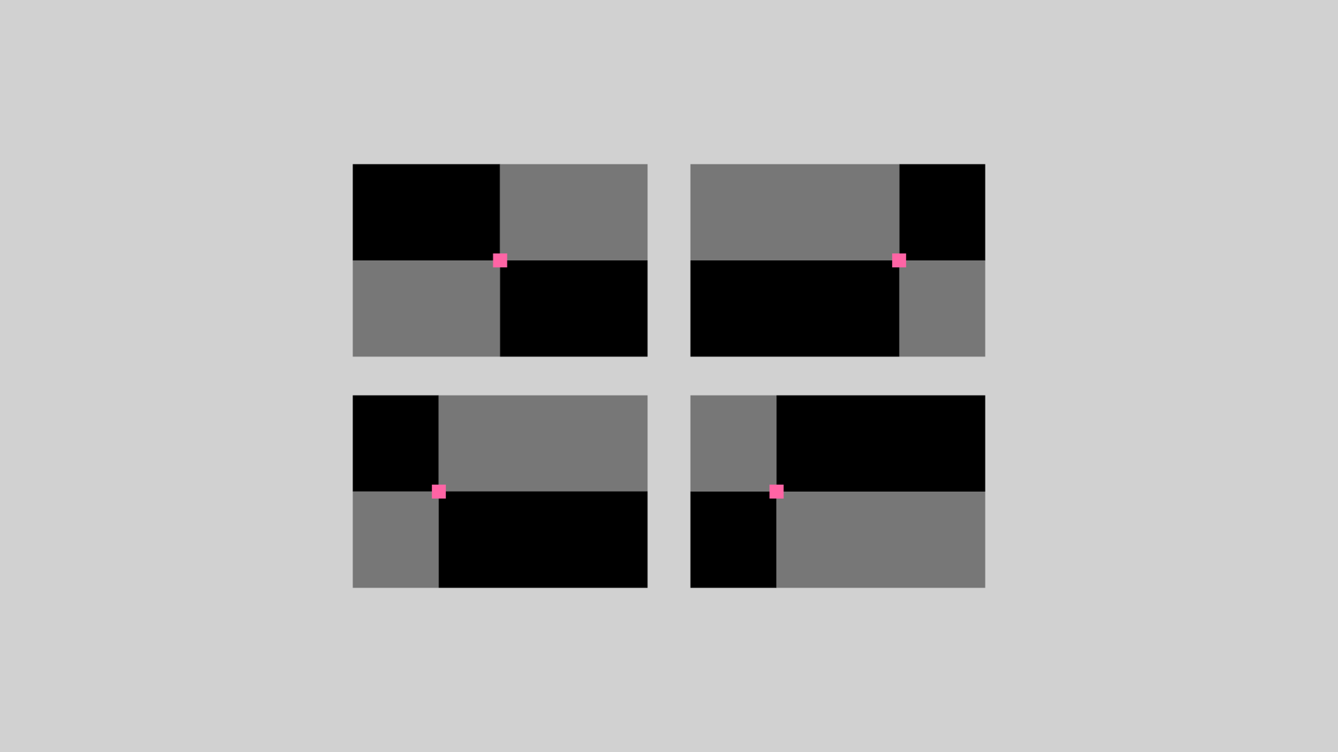
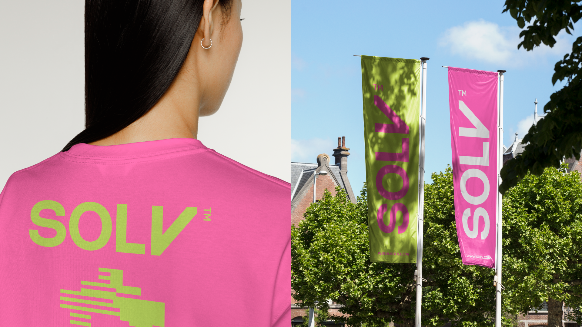
The concept of a lighthouse, with its light emanating from both sides, inspired the creation of the brand's supporting graphics. In this context, the lighthouse is symbolized by the pink square, while the white part represents its light. This representation is enriched by a gradient unique to the brand, which adds originality and flexibility to the project.
-
O conceito de um farol, com sua luz emanando de ambos os lados, inspirou a criação dos gráficos de apoio da marca. Nesse contexto, o farol é simbolizado pelo quadrado rosa, enquanto a parte branca representa sua luz. Essa representação é enriquecida por um gradiente exclusivo da marca, que acrescenta originalidade e flexibilidade ao projeto.