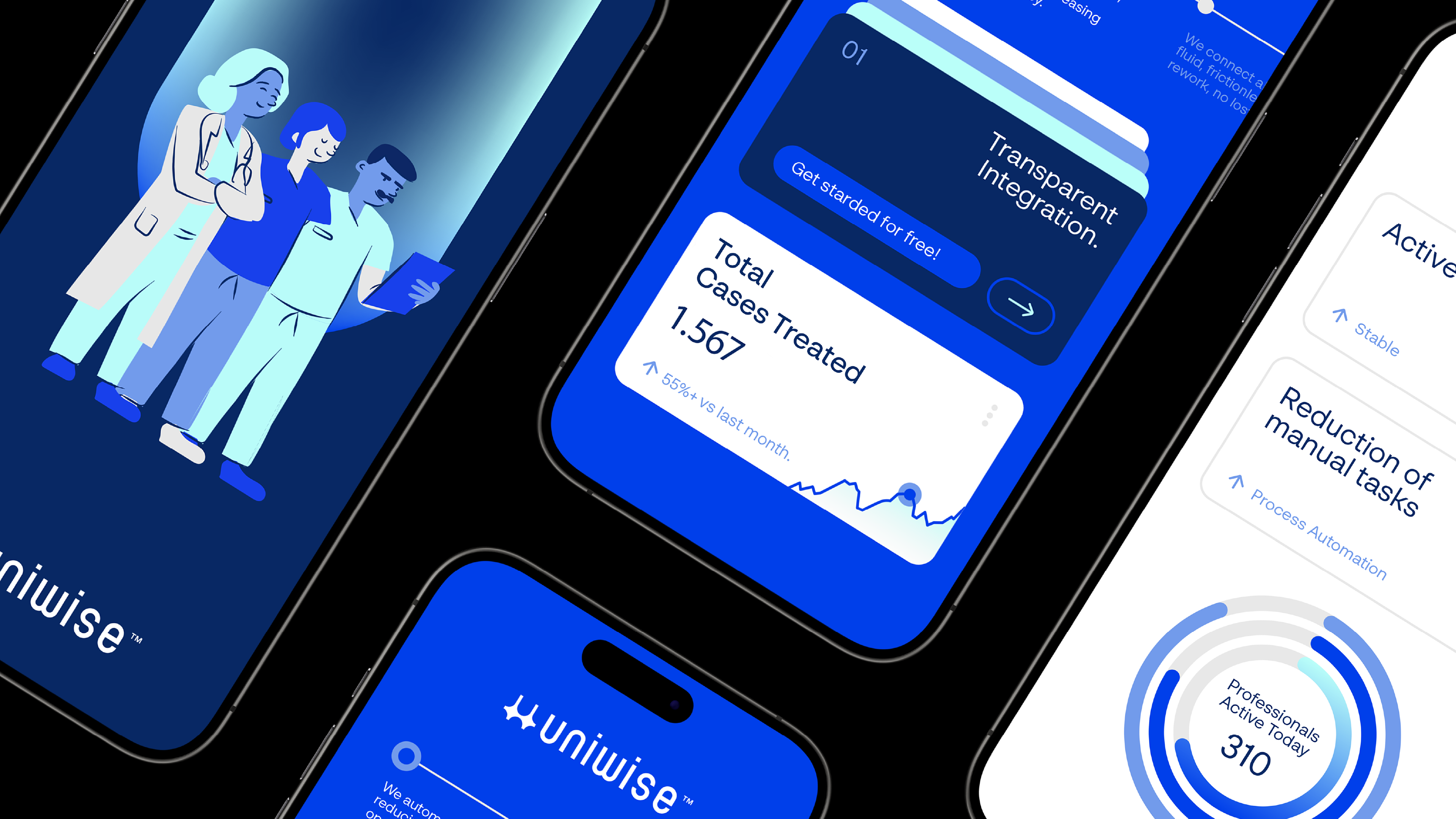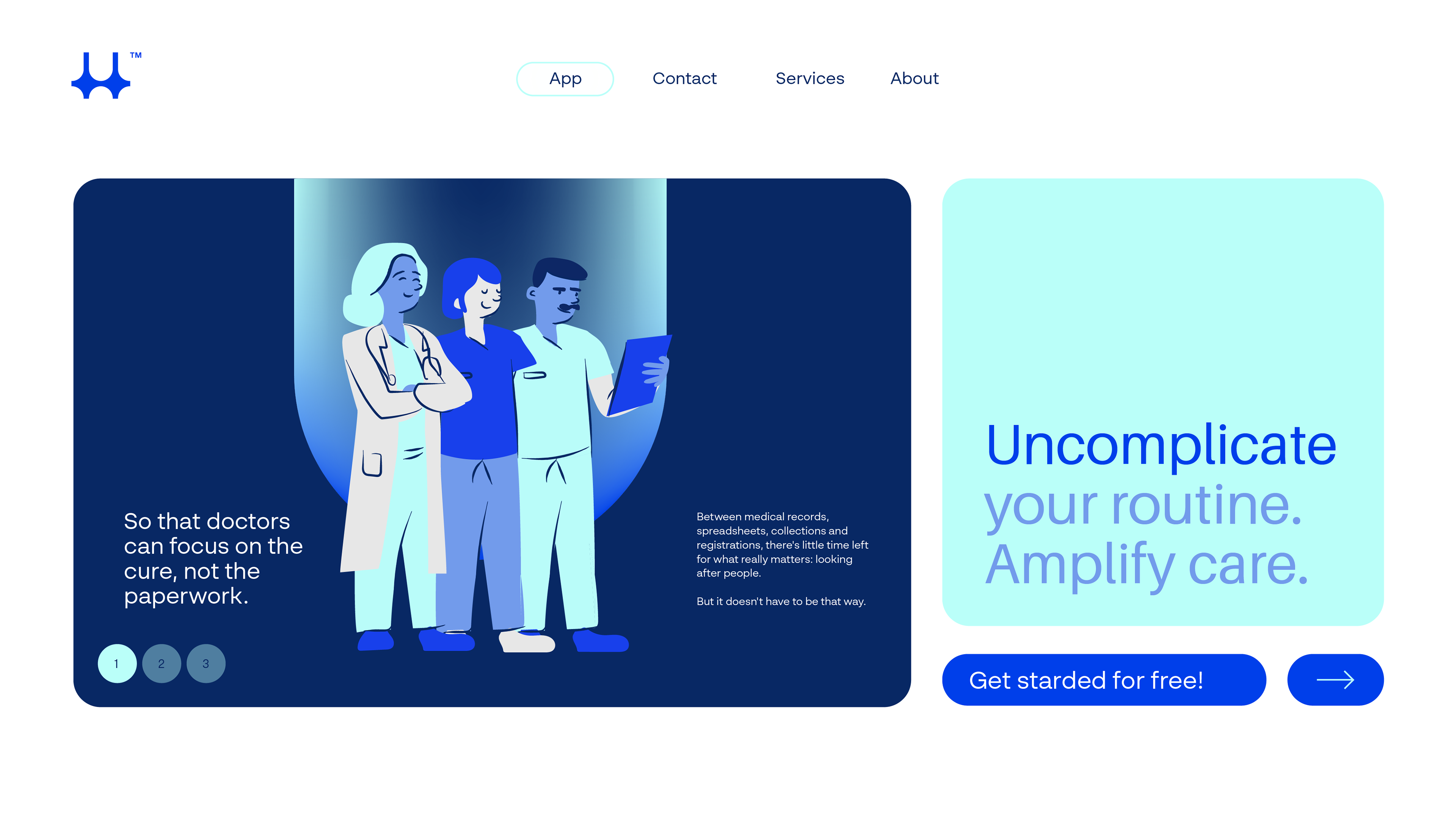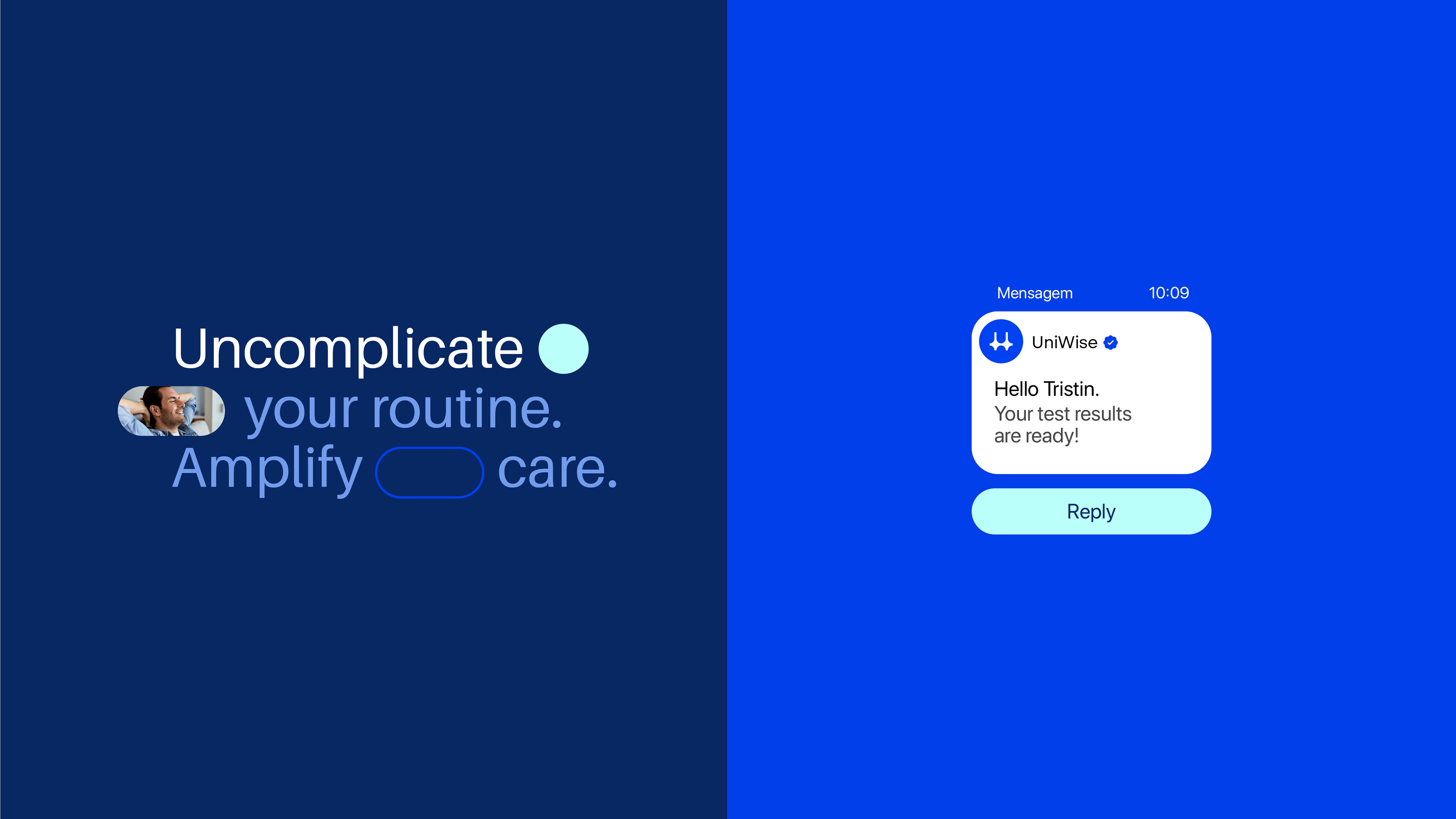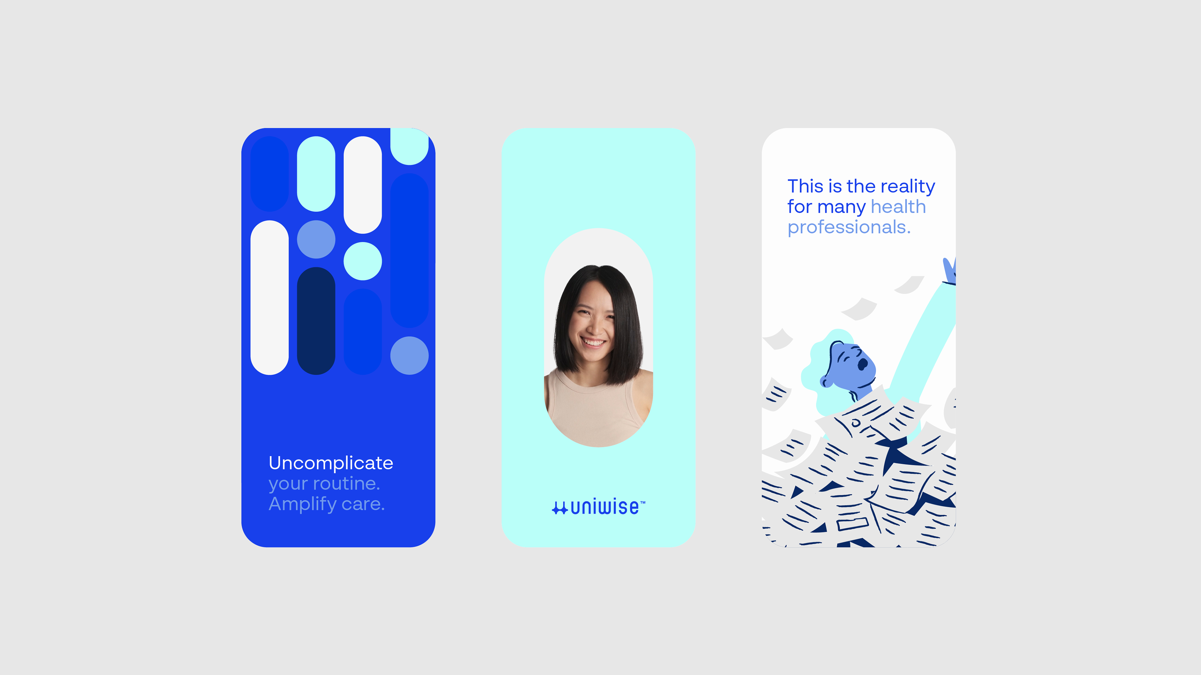
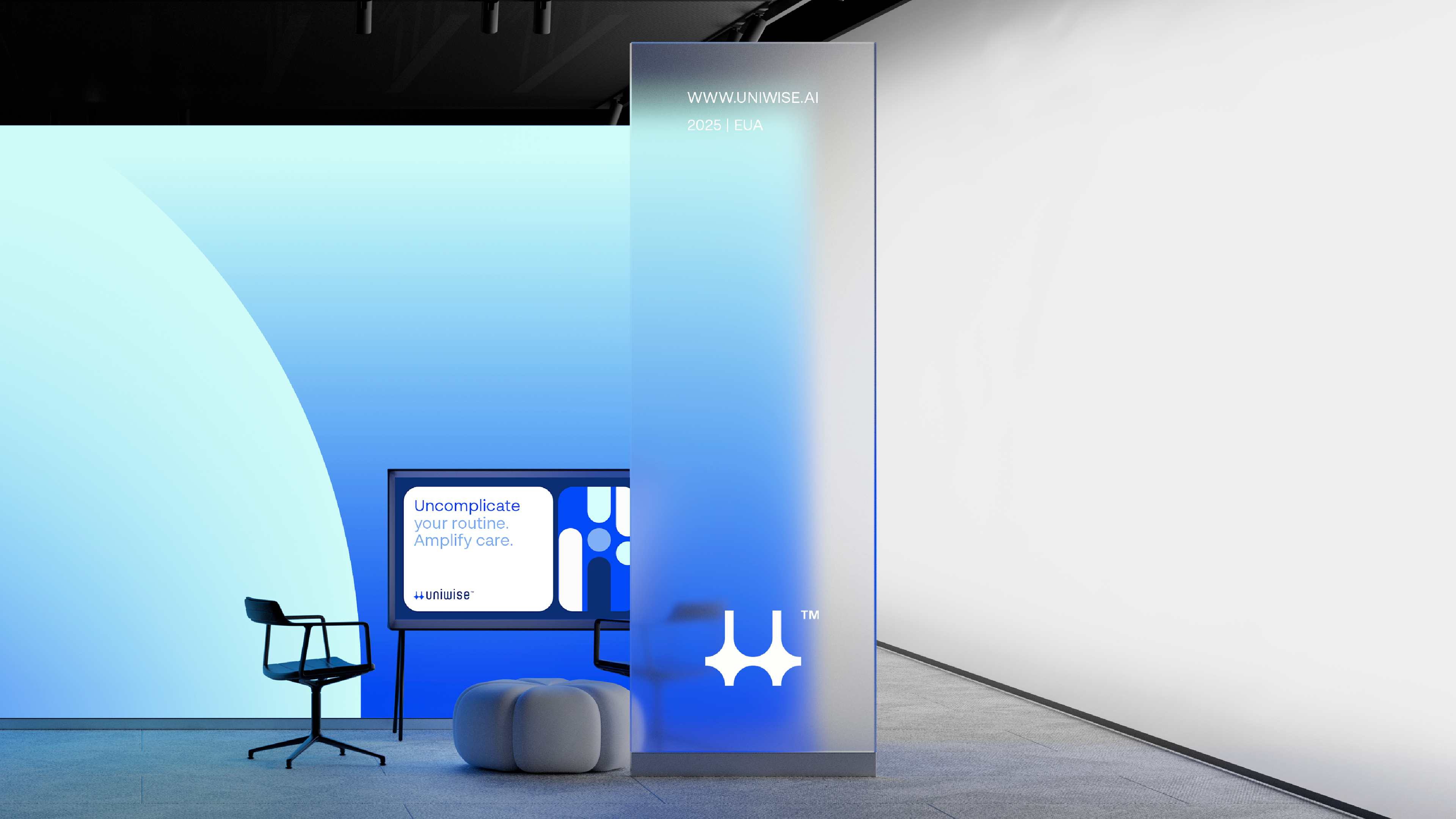
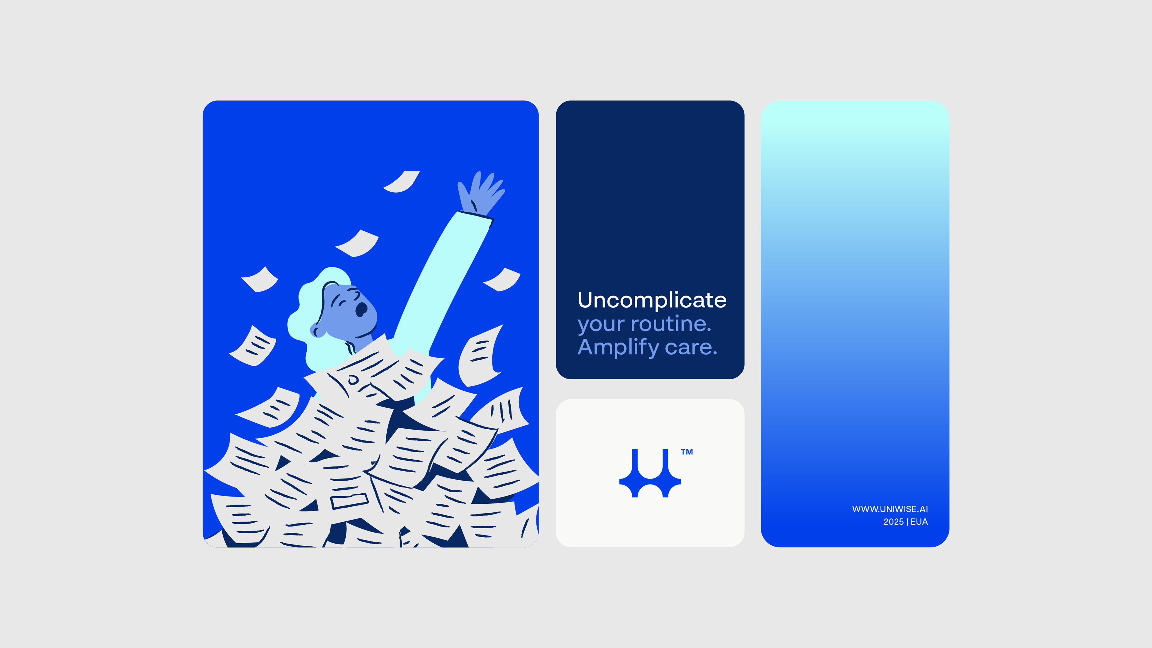
We turn data into care time.
The main objective of this project is to build a strategic and consistent visual identity for UniWise - a brand that brings together intelligent technology and clinical knowledge to ease the administrative burden in healthcare clinics.
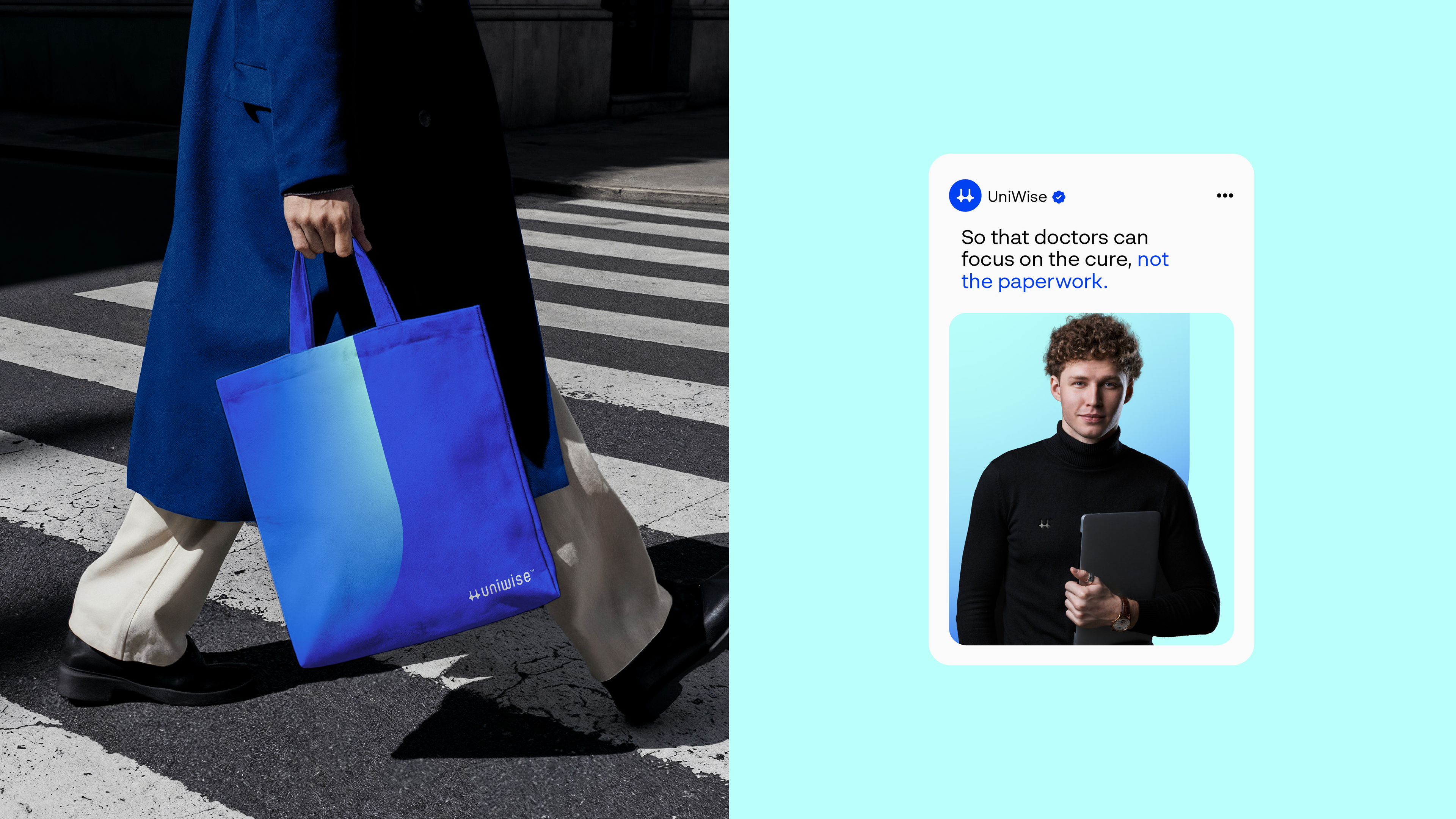
Our challenge is to visually translate UniWise's proposal as a reliable, empathetic and effective solution that empowers doctors and administrators to focus on what really matters: patient care.We will position UniWise as a benchmark in accessible innovation, reinforcing its mission to cure administrative pain with efficiency and humanity.

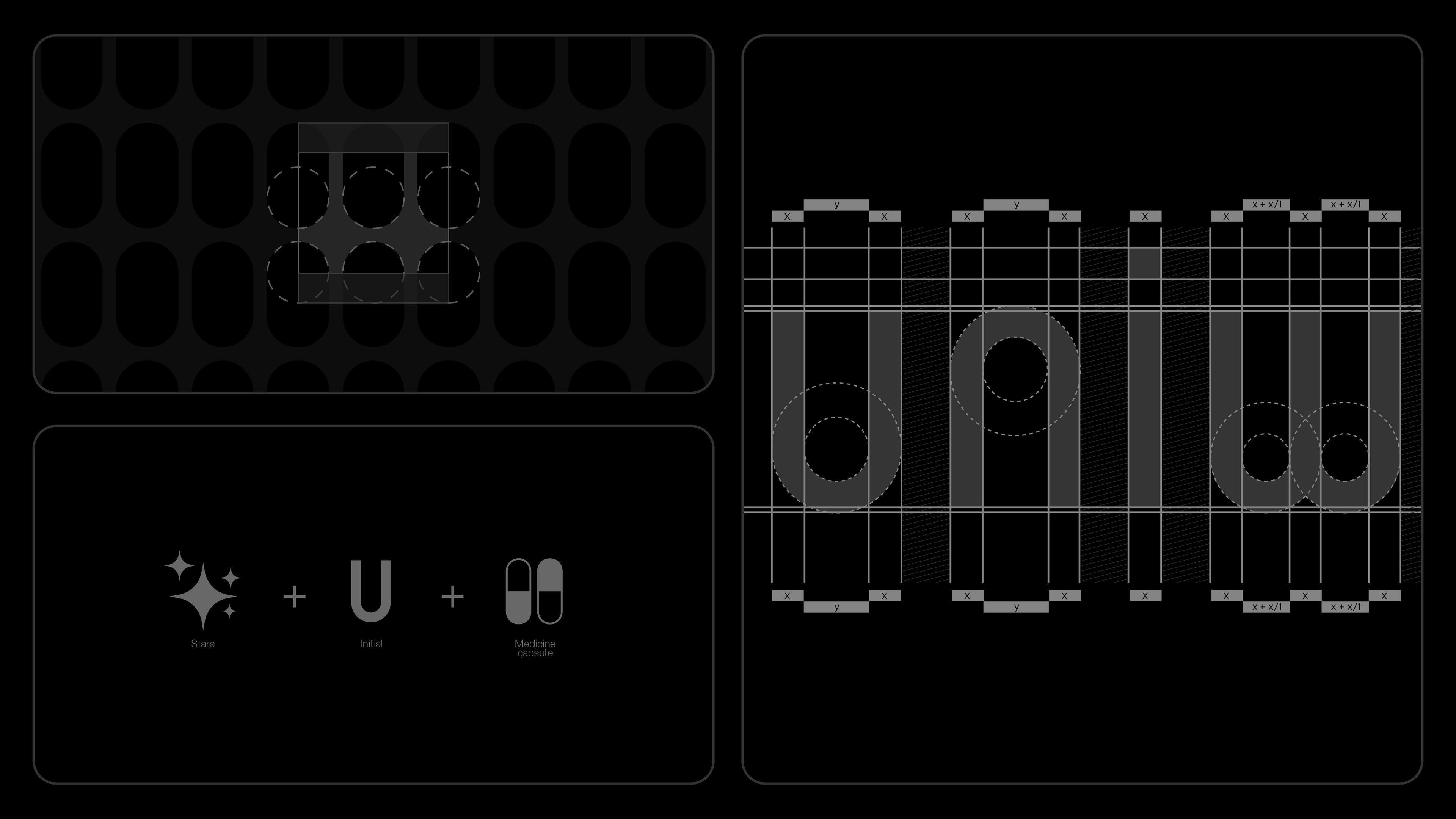
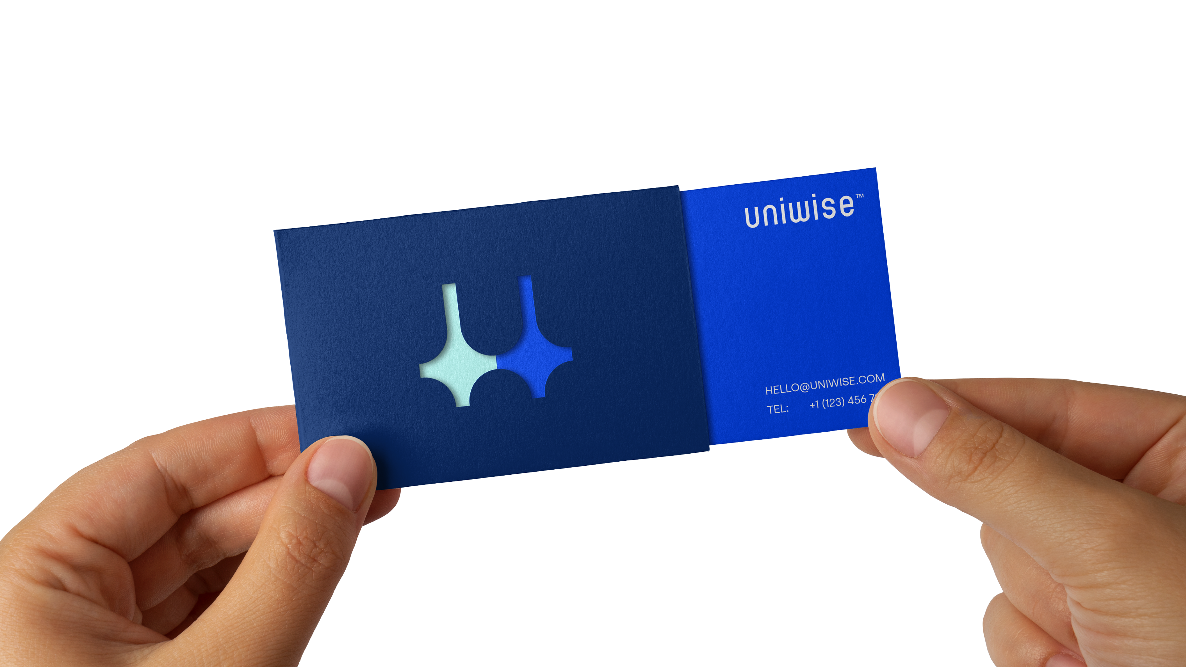
The UniWise icon is the result of the symbolic union of three central elements: stars, the letter “U” and a medicine capsule. Together, these components express the brand's pillars in a direct, sensitive and technological way.
The stars represent the use of artificial intelligence - a resource that guides, illuminates and expands the human capacity to understand, decide and act. Just as stars guide in the dark, UniWise's AI acts as a reliable compass in the midst of complex data and bureaucratic systems.
The letter “U”, the brand's initial, synthesizes its identity, while the capsule reinforces the idea of care, well-being and practical solutions - essential pillars for institutions that deal with people. The result is a unique and meaningful icon that translates technology with purpose, intelligence with humanity.
The grid of the UniWise icon was carefully developed from the geometric structure of medicine capsule holders, creating a symbolic and functional base that supports the brand's design. This choice reinforces the direct link with the universe of health and care, central themes in UniWise's positioning.
In the center of the mesh, the lighter gray icon emerges with precision and intention, aligned with the rounded contours of the system and based on perfect circles that guarantee harmony, balance and visual rhythm. Each element follows exact proportions, ensuring aesthetic coherence and applicability on any scale.
More than a technical guide, this grid represents the brand's purpose: to organize chaos, transform complexity into clarity and deliver, with intelligence and sensitivity, an accessible, human and reliable experience for users.