
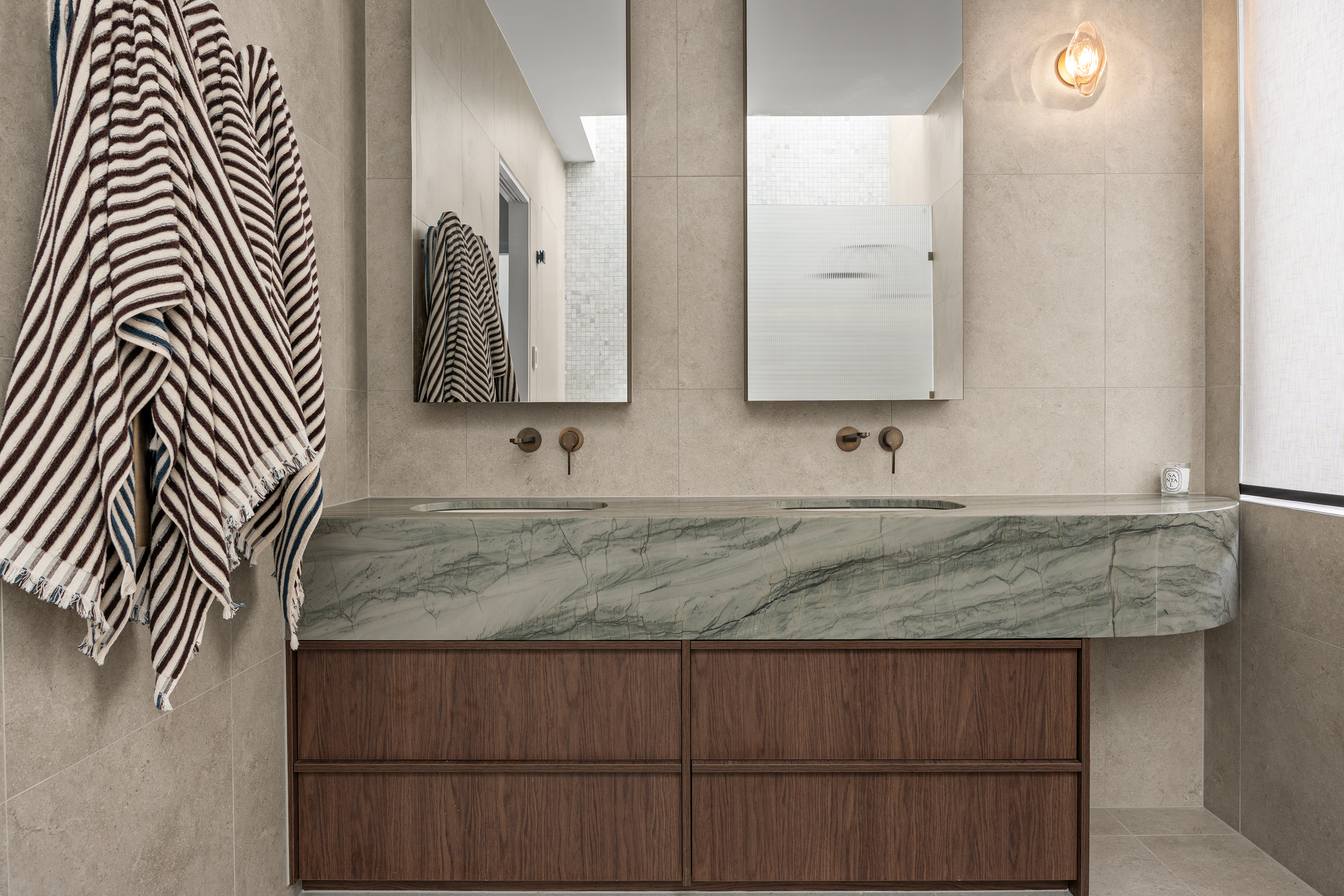
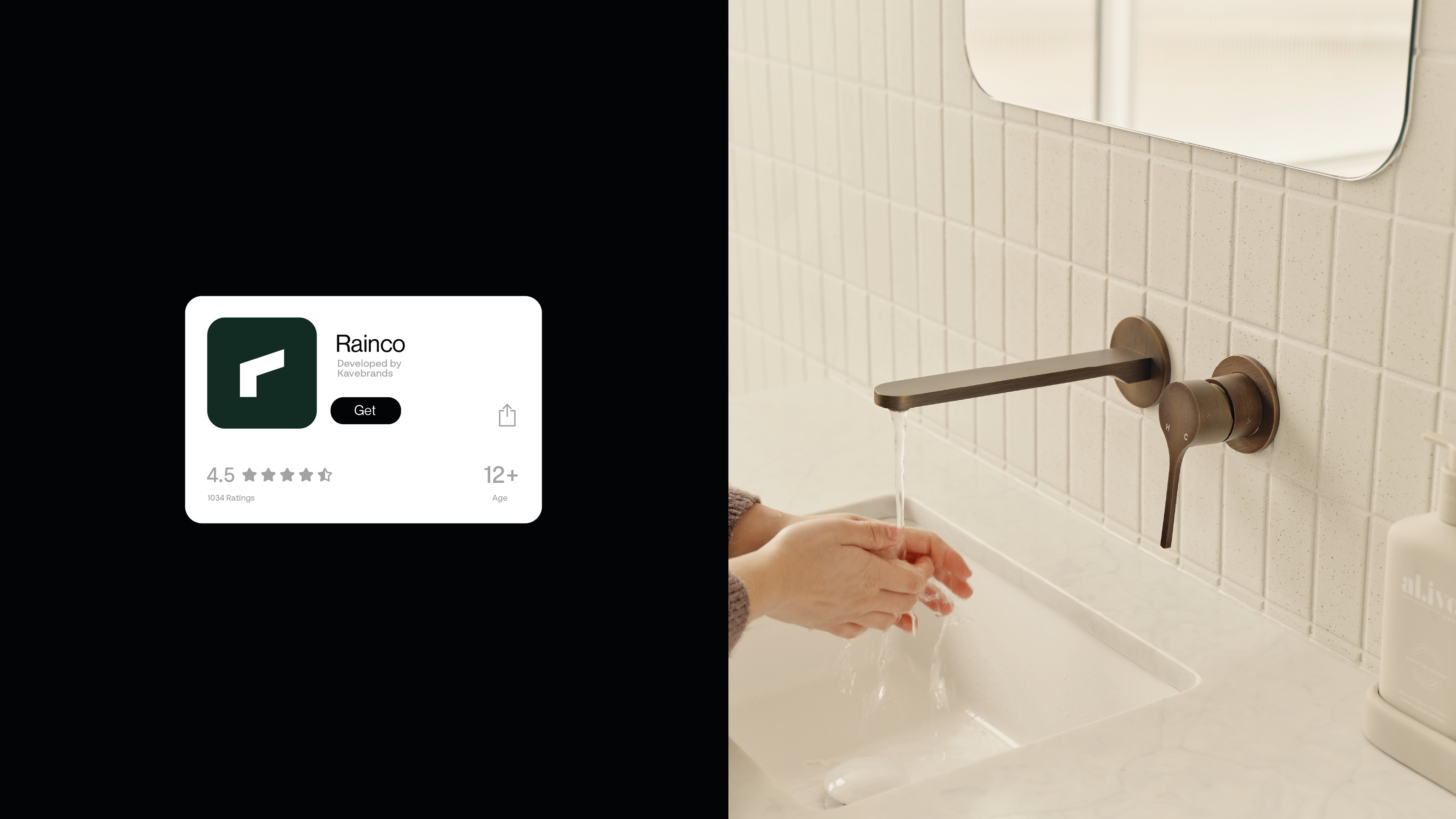
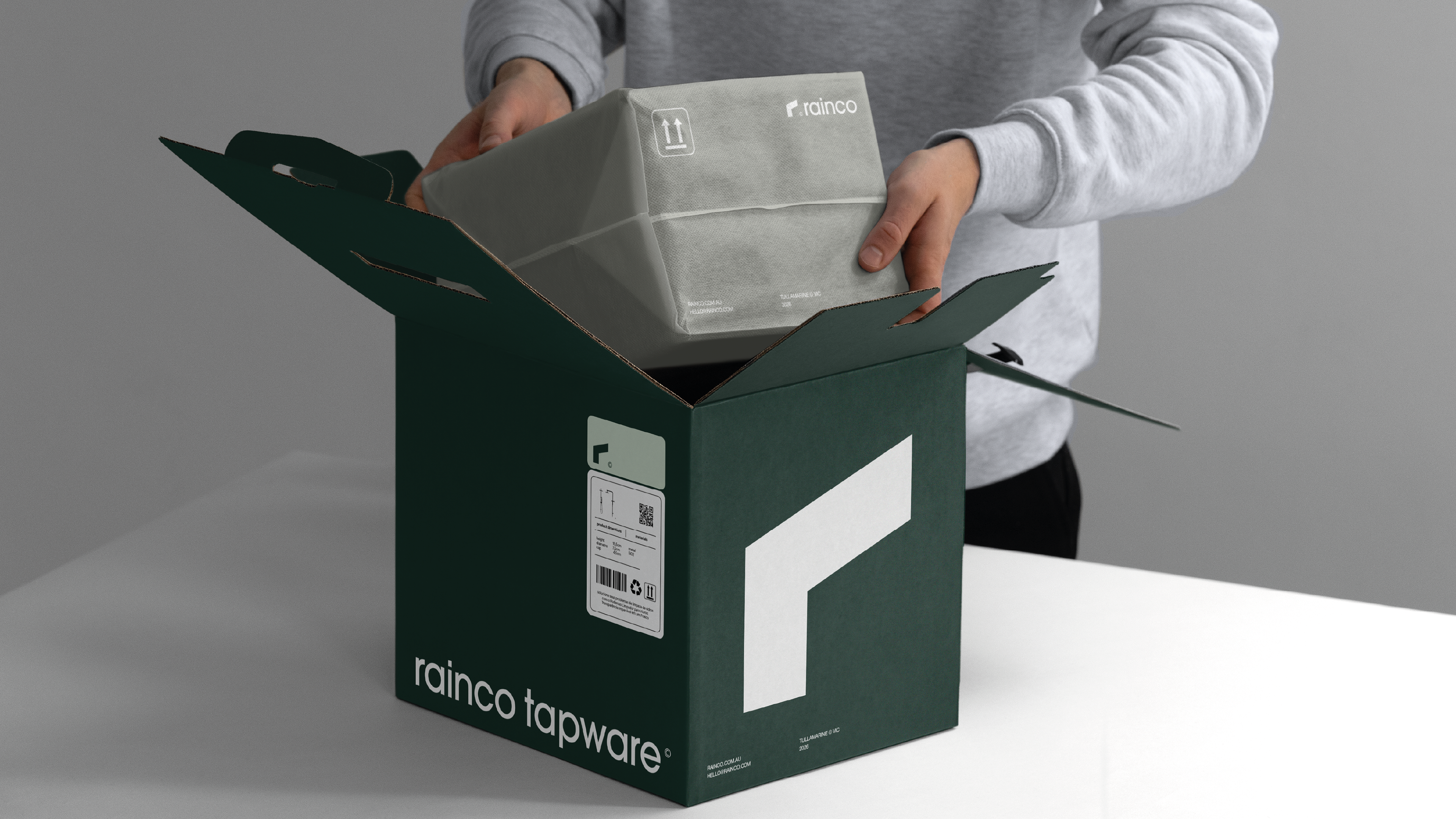
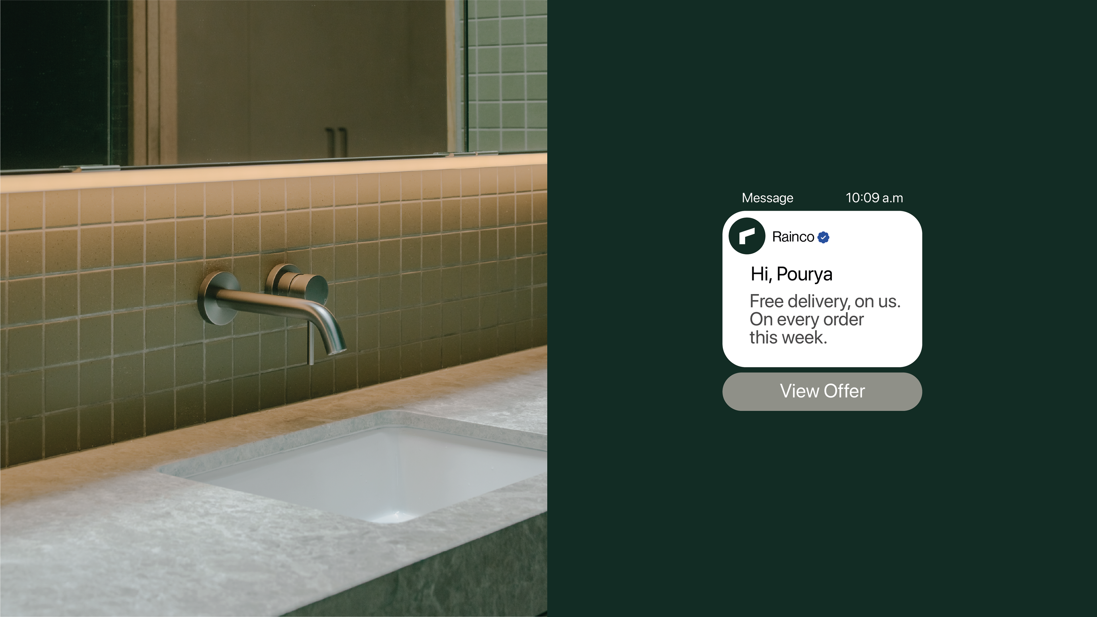
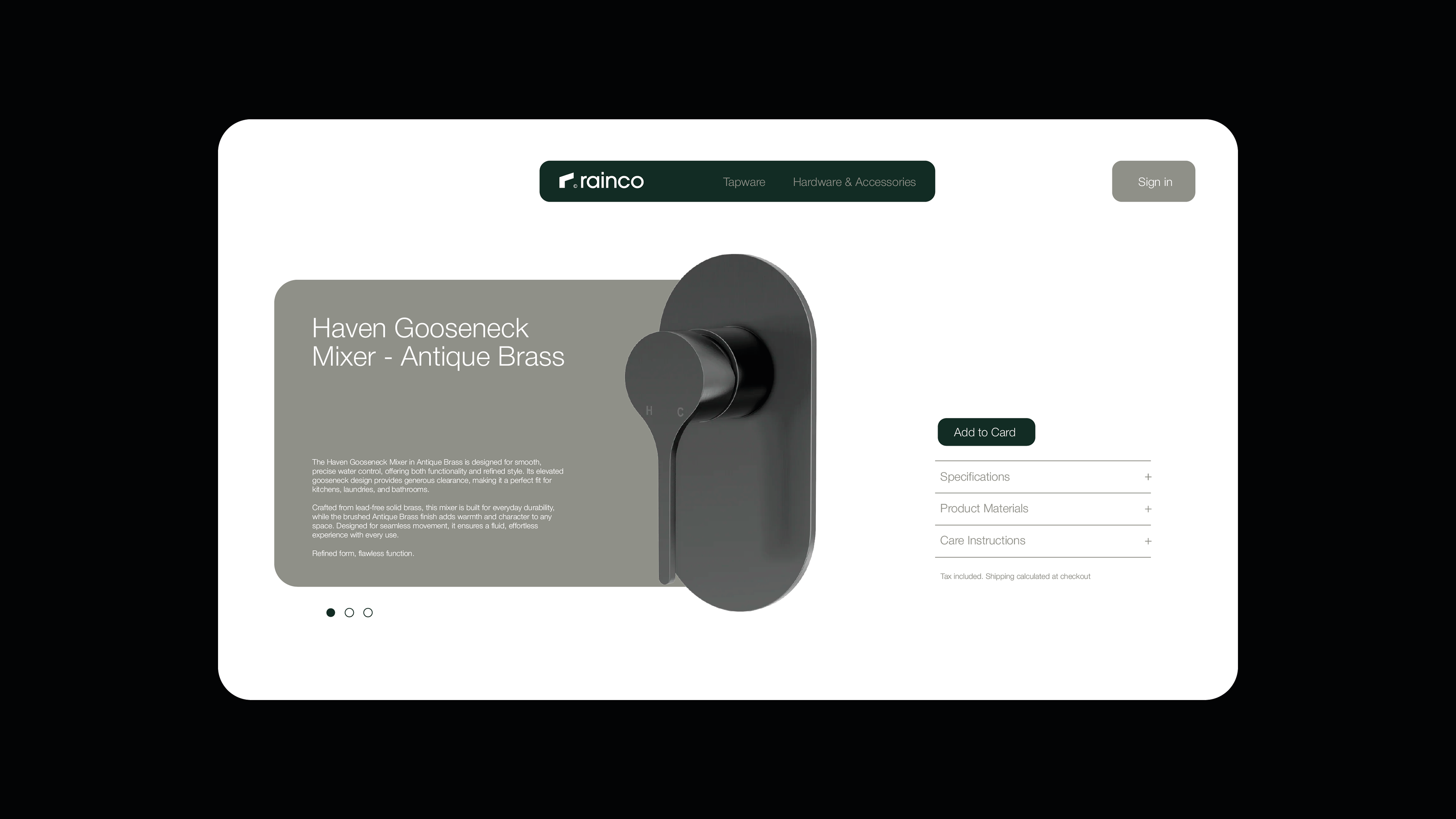
Rainco is an Australian design brand from Tullamarine, Victoria. It makes tapware, hardware and accessories for the home. Its mixers, handles and hooks are made from lead-free solid brass in warm finishes like antique brass and brushed copper, for kitchens, bathrooms and laundries.
Rainco sees these pieces as the details of a house: small, specific, and used every day. Most brands in the category sell the whole kitchen or bathroom. Rainco sells the part you actually touch. A tap is the first thing you reach for in the morning, and a handle is how you open the day. Rainco designs them to be precise, durable and quietly refined, so they last for decades instead of a season.
Tapware is only the start. The brand's focus is the detail itself, so it can grow into other home objects without changing who it is. It stays close to the everyday and is made with care down to the millimeter.
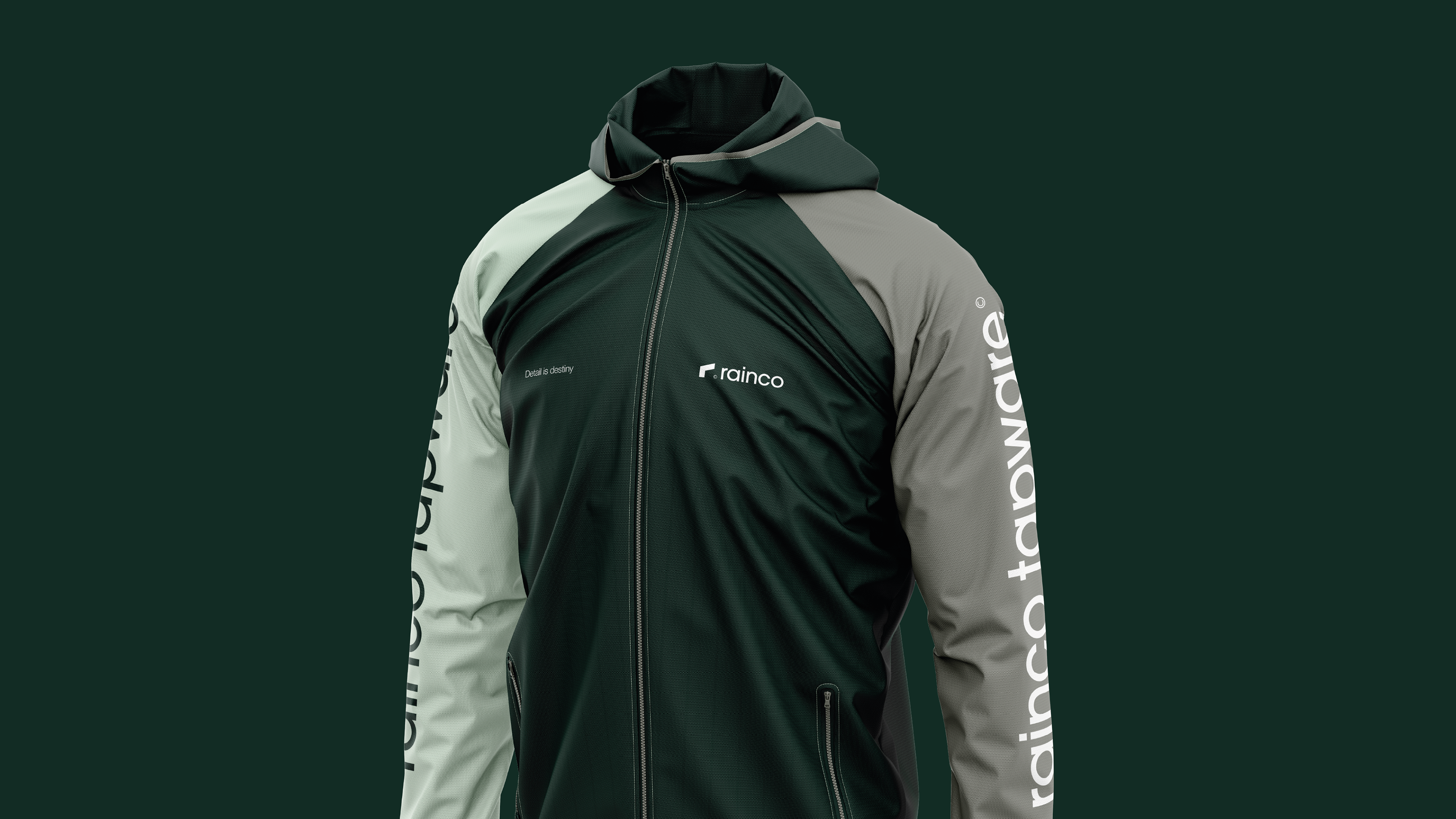
Detail is destiny.
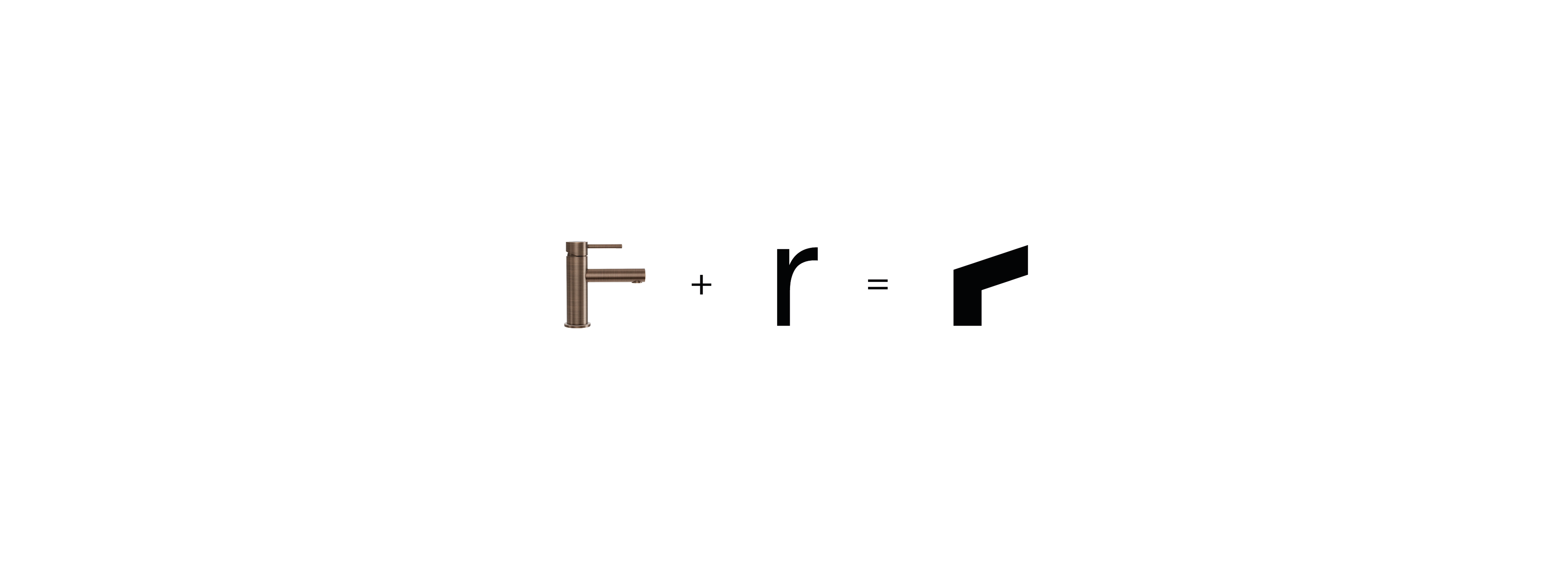
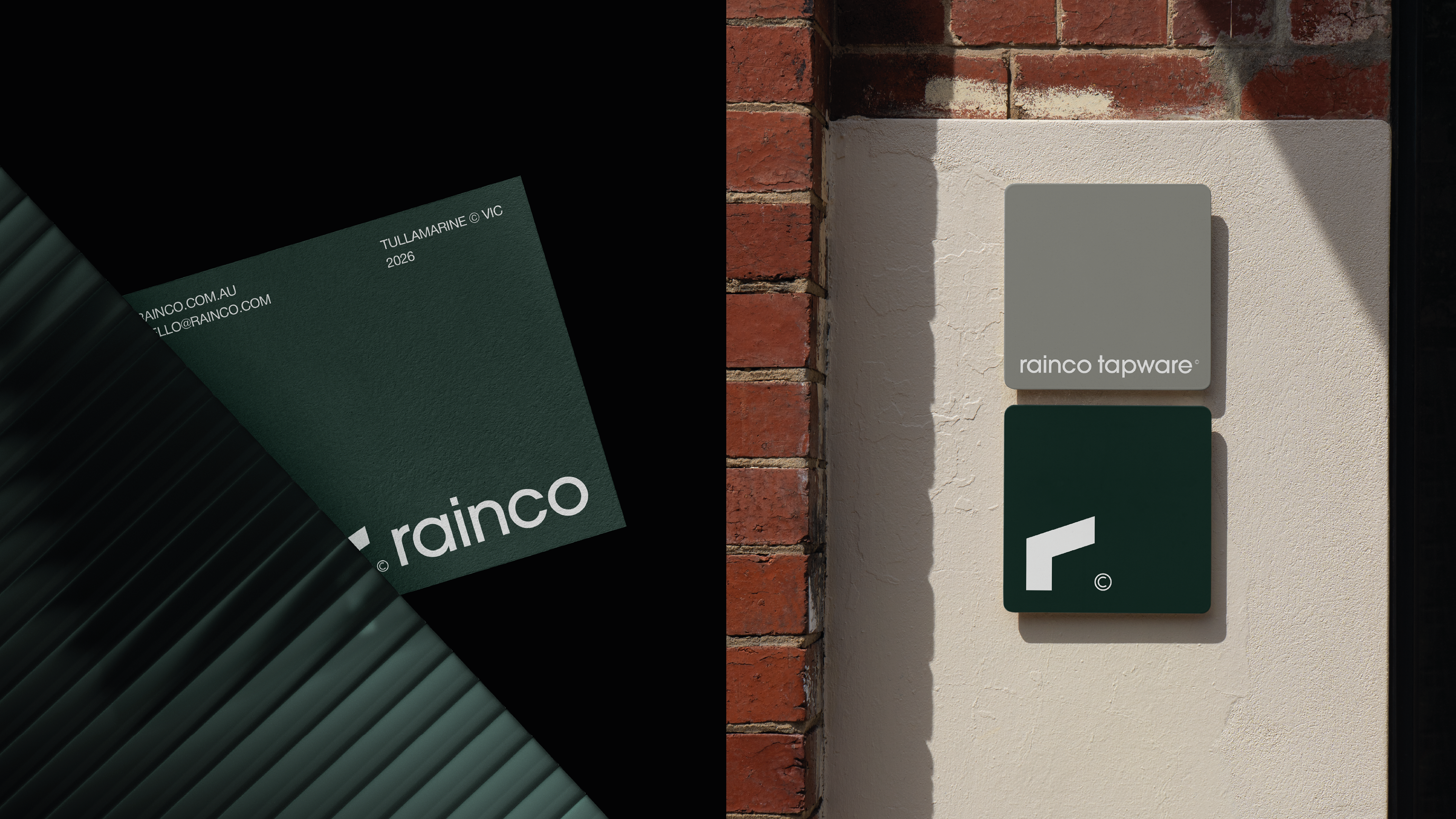
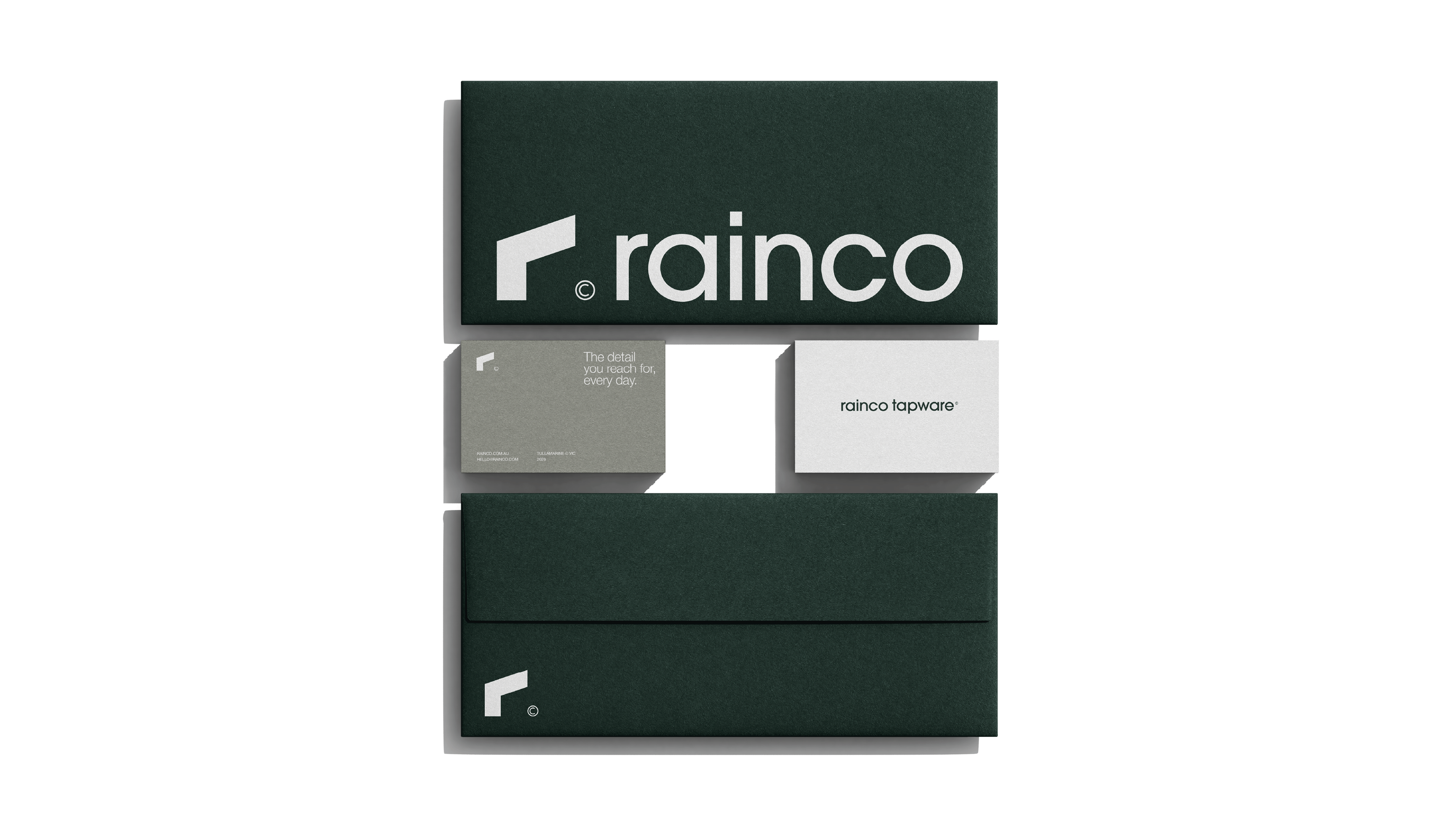
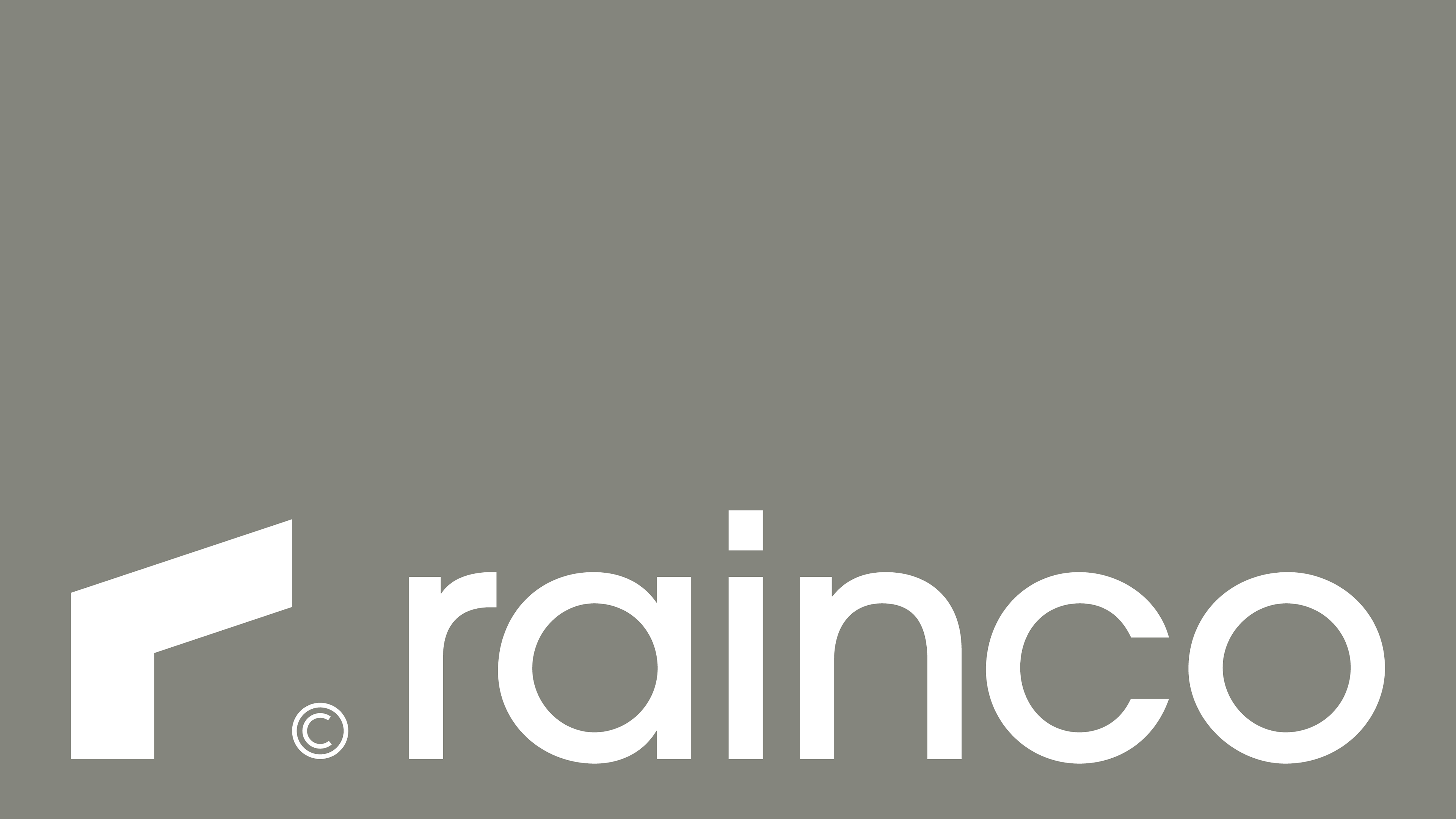
Rainco's icon was drawn from a single equation. The product itself, simplified, and the letter that names it, simplified, share the same form: a vertical stem, a horizontal arm, a clean diagonal cut at the top. What looks like the silhouette of a tap is also a lowercase 'r'. What looks like a letter is also a piece of brass.
This dual-reading is strategic. The icon performs what few symbols can — total compression of brand and category in one glyph. Read it as letter, and you have the initial. Read it as object, and you have the product. Both readings reinforce the same idea: Rainco is what it makes, and what it makes is what it is. Built on grid logic and finished with a single decisive cut, the symbol shares the same architectural discipline as the typography and the brand voice. It does not decorate — it states.

Design Direction
Igor Nora
Research & Strategy
Igor Nora, KAVE BRANDS
Photos taken by
4finitty, Simon Shiff
__
Follow us: