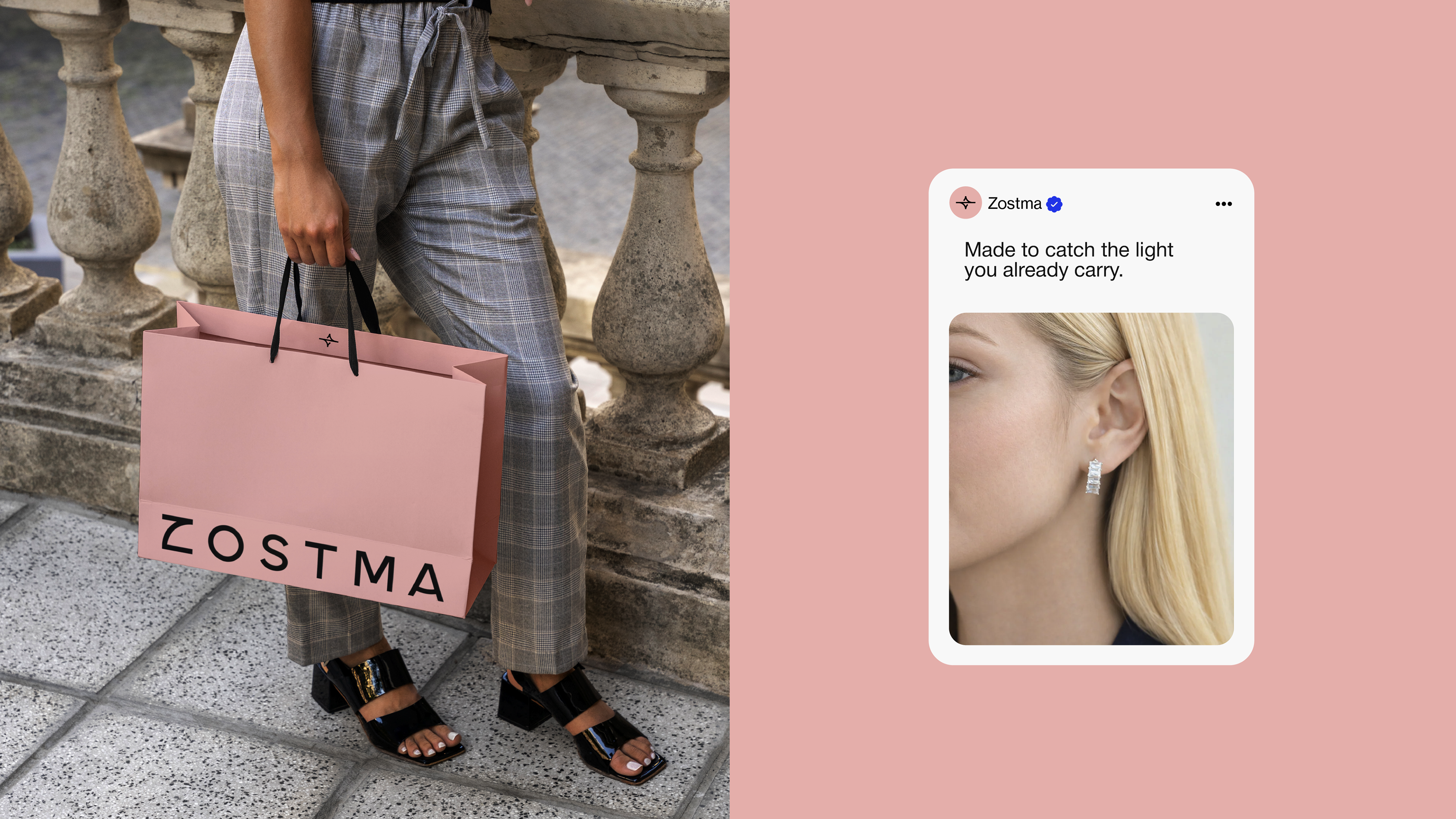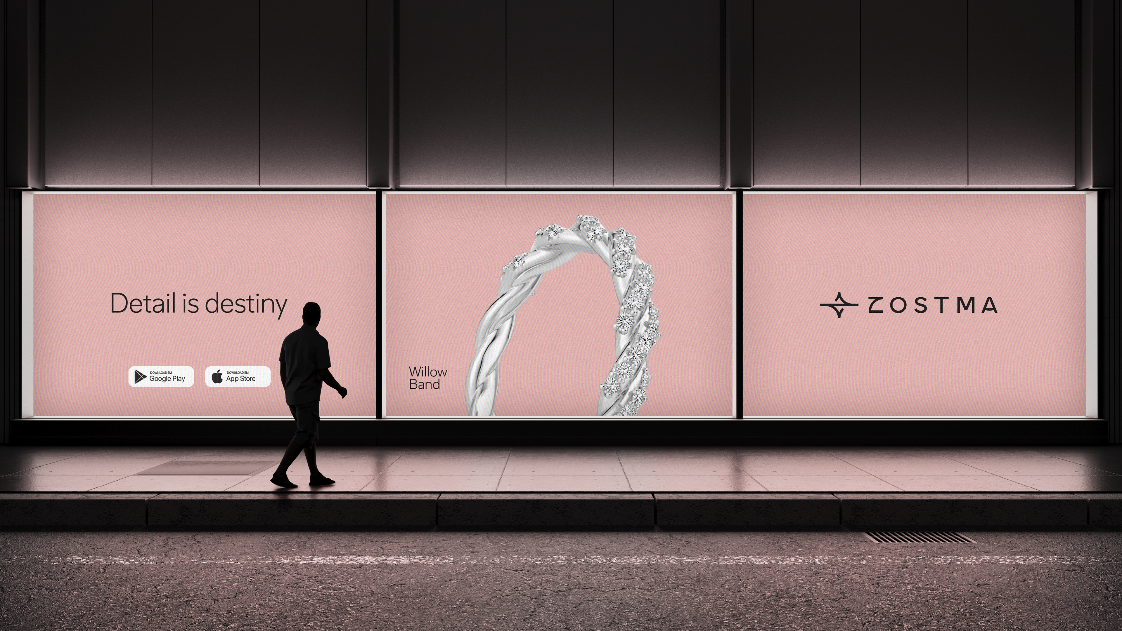
"Every moment is worth wearing" takes the category's deepest habit — saving the precious for the rare — and quietly refuses it. Jewellery is built around the milestone: the engagement, the anniversary, the occasion that finally earns the piece. The everyday is treated as not enough. This line says the opposite — the quiet morning, the ordinary Tuesday, the evening that no one photographed are already worth it. The phrase carries four layers at once. The product truth — these pieces are made to be worn now, every day, not stored for someday. The emotional one — your life isn't only its highlights; the small, unremarkable moments are the ones you actually live in, and they deserve to be marked. The internal one — Zostma exists to dissolve the line between "special" and "everyday," so feeling precious stops being something you wait to earn. And the universal — a life isn't measured by its few big moments but by how you inhabit all the ordinary ones. The territory is ownable because the category sells the occasion. Zostma sells the everyday, made to feel like one.
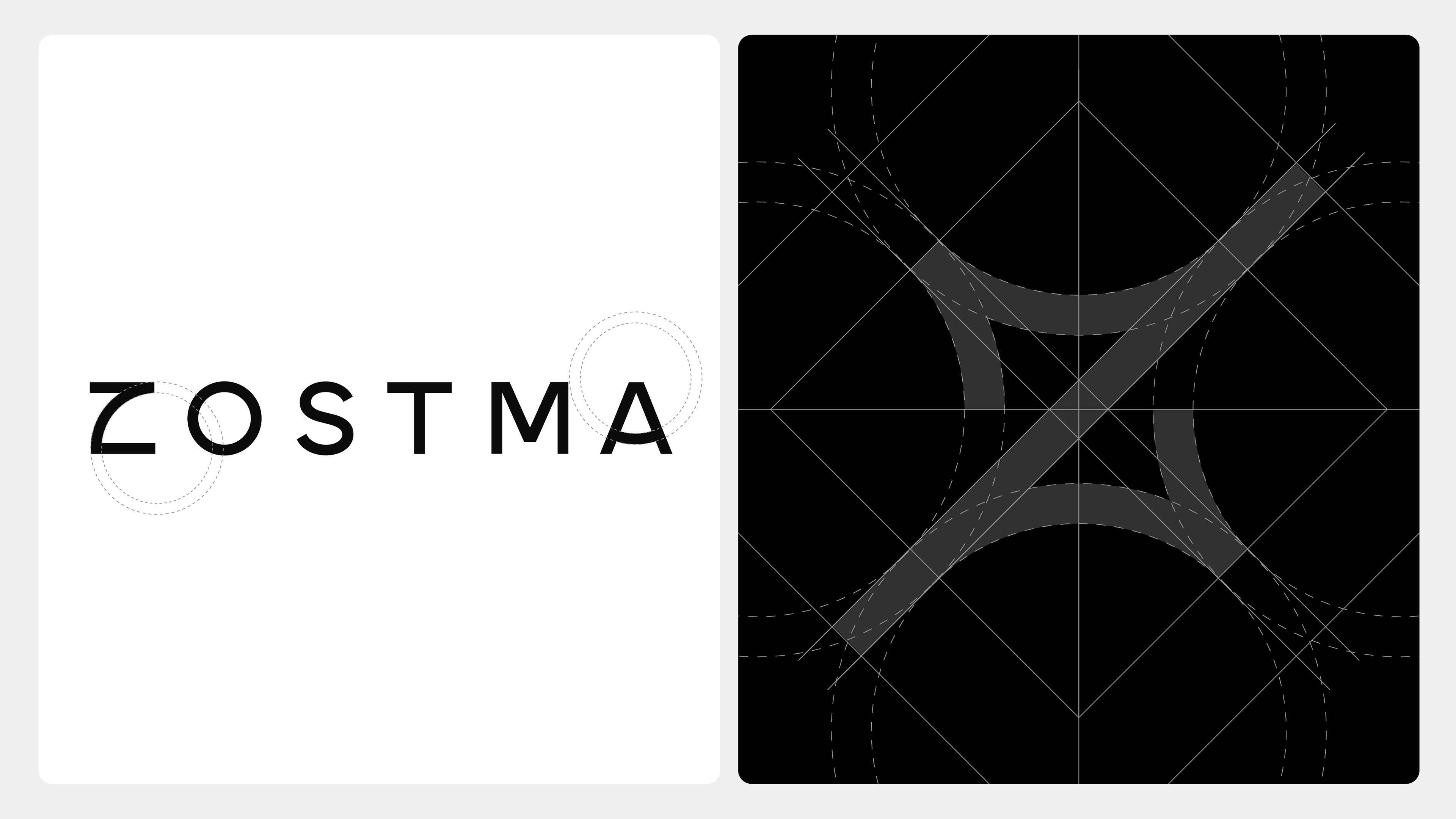
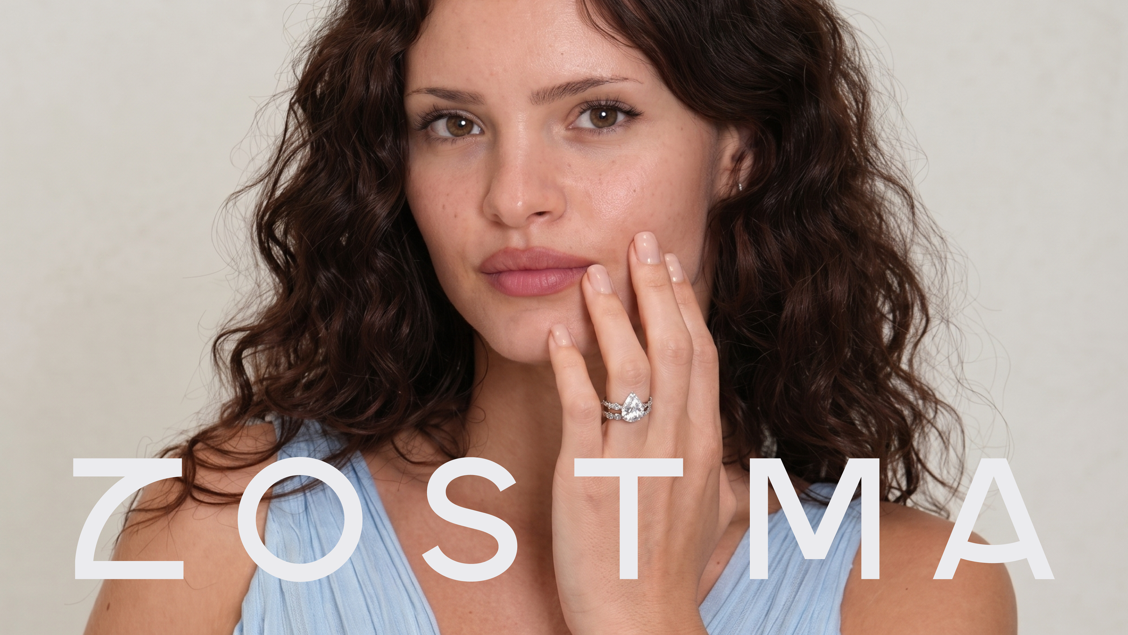
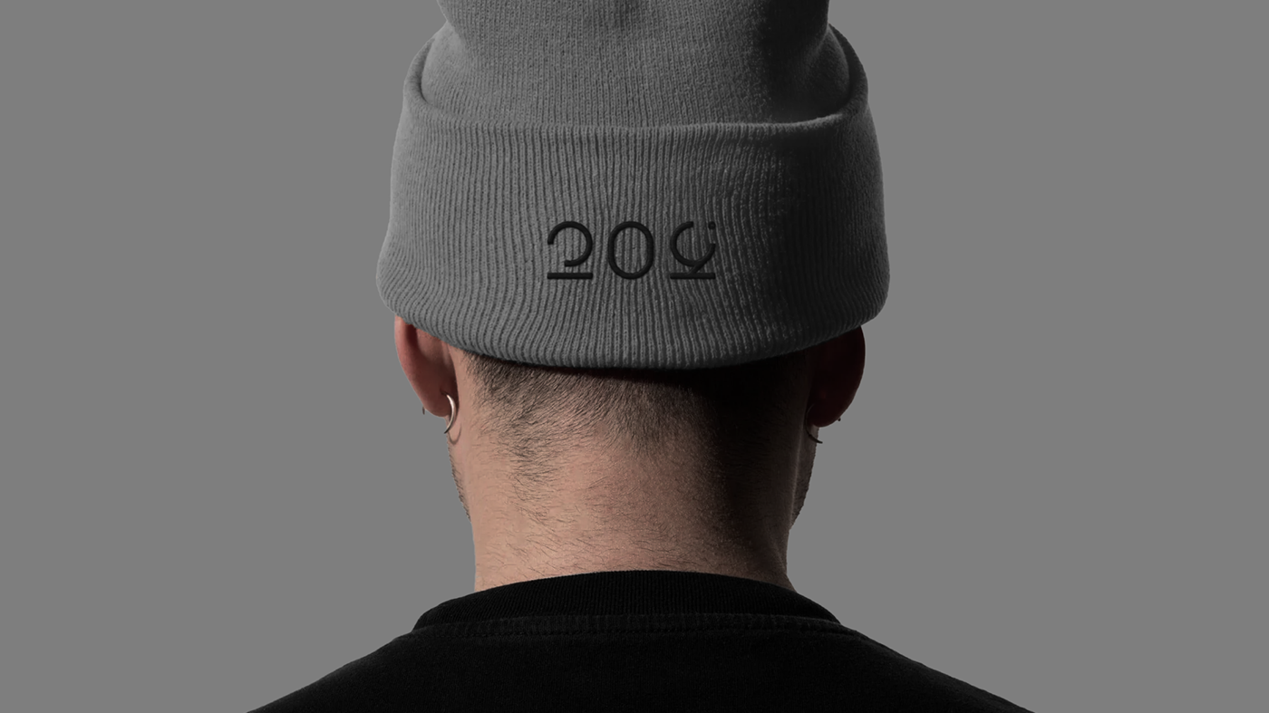
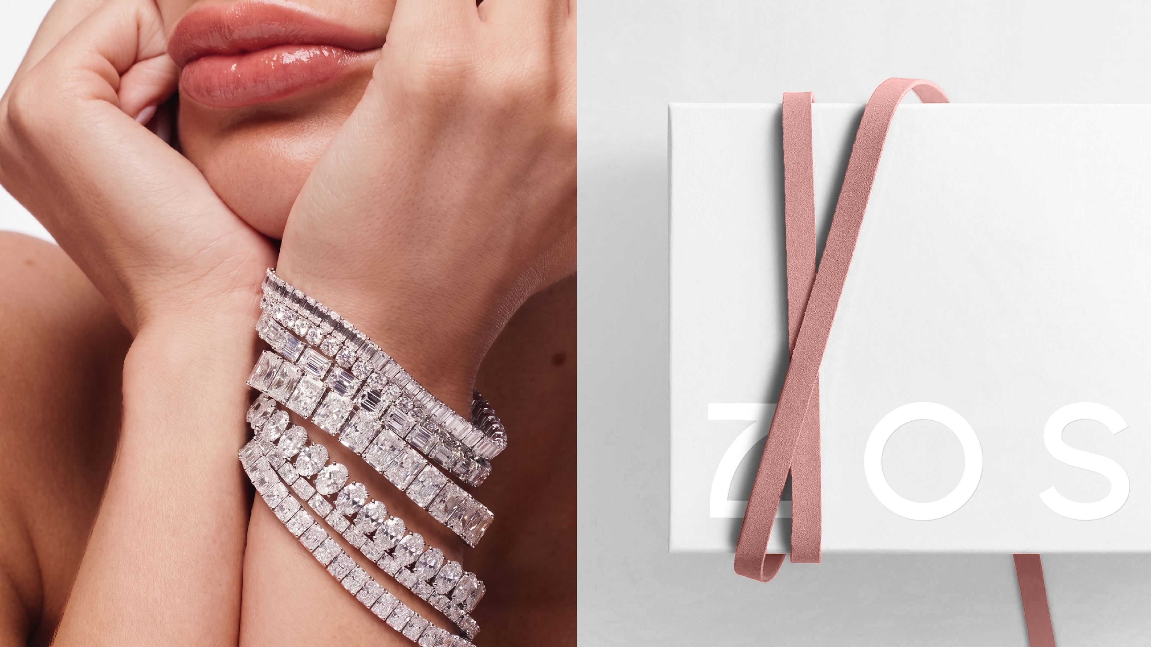
The Zostma wordmark was drawn from the ground up — not typed, not licensed, built. It's a geometric sans of even weight and open aperture: confident, modern, unfussy, with no serif nostalgia and no decoration to date it. The proportions are wide and calm, letters given room to breathe, so the name reads as composed rather than loud — the visual register of a brand that doesn't need to shout to be taken seriously. Every curve and terminal was decided, which is the whole point: in a category where most logos are a trending typeface with the tracking opened up, a wordmark engineered letter by letter is the signature no competitor can reproduce.
What ties it to the rest of the identity is its geometry. Several letters are cut from the exact circles that build the icon — the same arcs that carve the spark's concave sweeps return as the curve of the Z, the bowl of the S, the round of the O. Symbol and wordmark aren't two ideas placed side by side; they're one system in two forms, sharing a single geometric DNA. And it carries the brand's defining tension in its own construction: rigid diagonals meeting circular arcs, the geometric meeting the human — structure you can trust, warmth you can feel. Built with a compass. Read as a name. Owned outright.
Nothing here is freehand. The mark is built on a closed geometry — a square, its eight radiating axes, and four large circles whose arcs carve the concave sweeps between the points. The straight diagonals strike outward; the curves pull back toward the centre, the way light concentrates through a faceted stone. Every line answers to the grid. That discipline isn't decoration — it's the proof that what reads as effortless was engineered. The same promise the product makes: precision you can trust because it was built, not faked.
And the construction holds a tension on purpose: rigid diagonals meeting circular arcs, the geometric meeting the organic. It's the exact balance the brand keeps everywhere — the geometric-humanist type, the precise-but-warm voice, a structured shine that still feels human. Radial in every direction, the spark throws light to all four corners — universal, everywhere, the meaning of the name made visible in the form. Built with a compass and a straightedge. Felt as a glint.
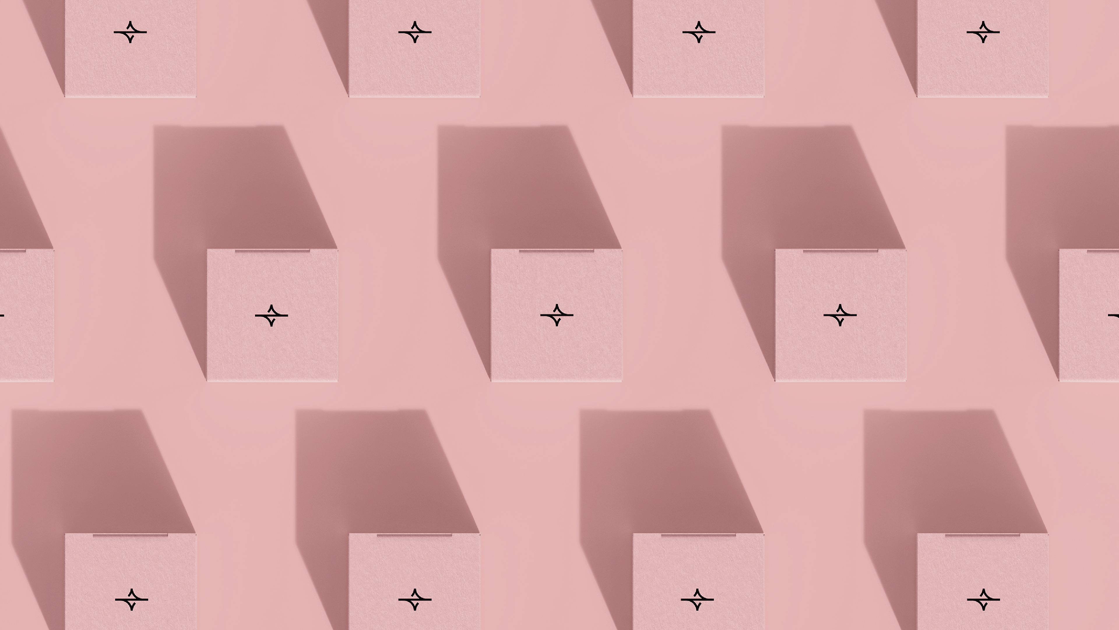
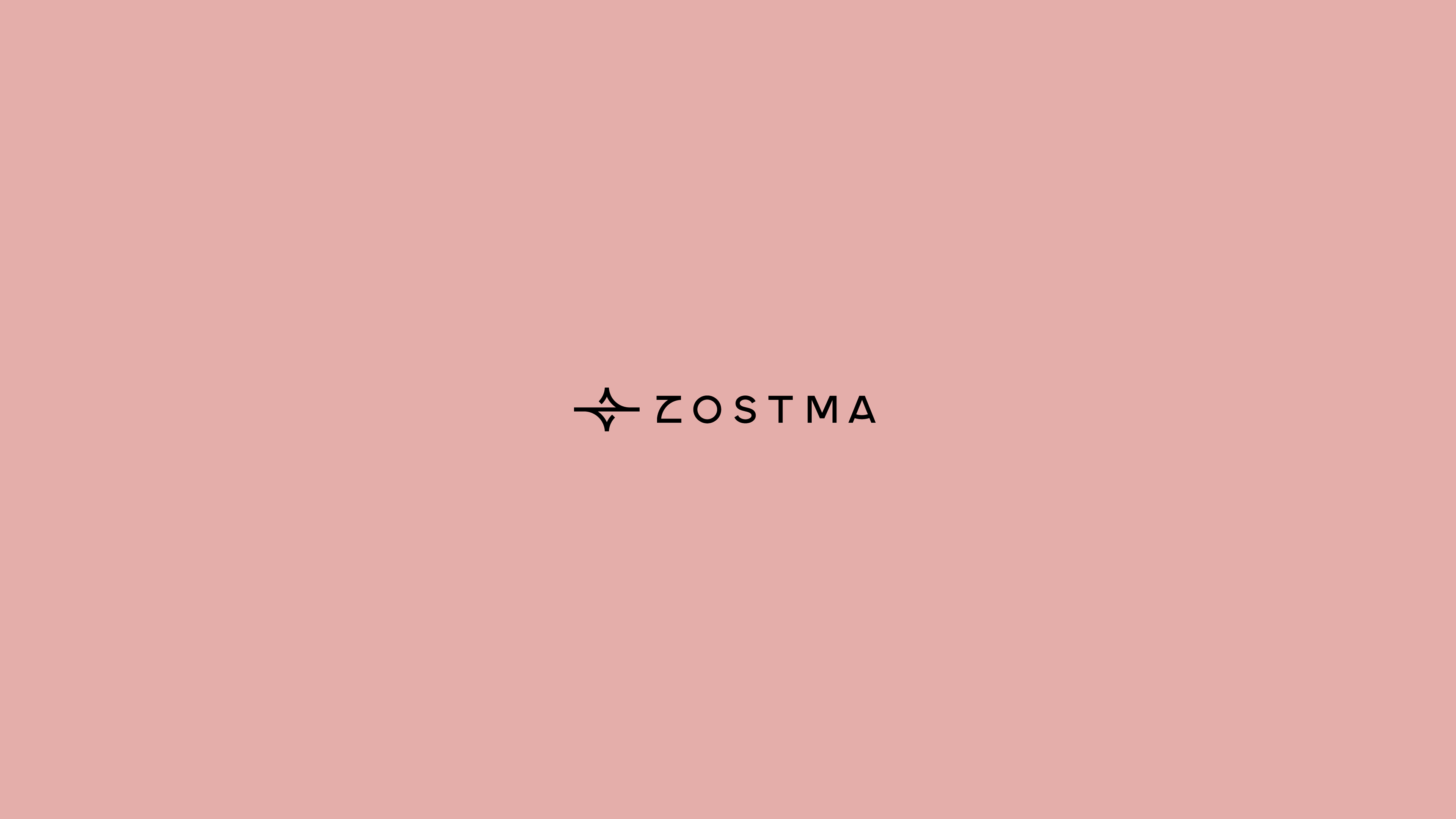
Every jewellery brand reaches for the sparkle. The four-point glint is the category's most primal sign — the flash of light on a cut stone, read instantly, owned by no one. A sparkle alone is a commodity. Zostma's mark adds the missing half: the brand's initial, the Z, folded into the light, its diagonal becoming the diagonal of the spark. And the two resolve into a third thing — a form whose crowning curve cradles like a setting, the top of a ring holding its stone. Shine, signature, and jewel in a single stroke. What was generic becomes proprietary: the most universal symbol in jewellery, redrawn to mean one brand and no other.
But the spark is more than a clever lockup. It's the brand's idea compressed into one glyph — the instant light meets a stone and beauty is seen. Not added. Revealed. The mark is that flash of recognition: small, bright, repeatable, an everyday glint rather than a rare, staged shine. A spark you can wear on a Tuesday. The category draws a diamond. Zostma draws the moment it catches the light.
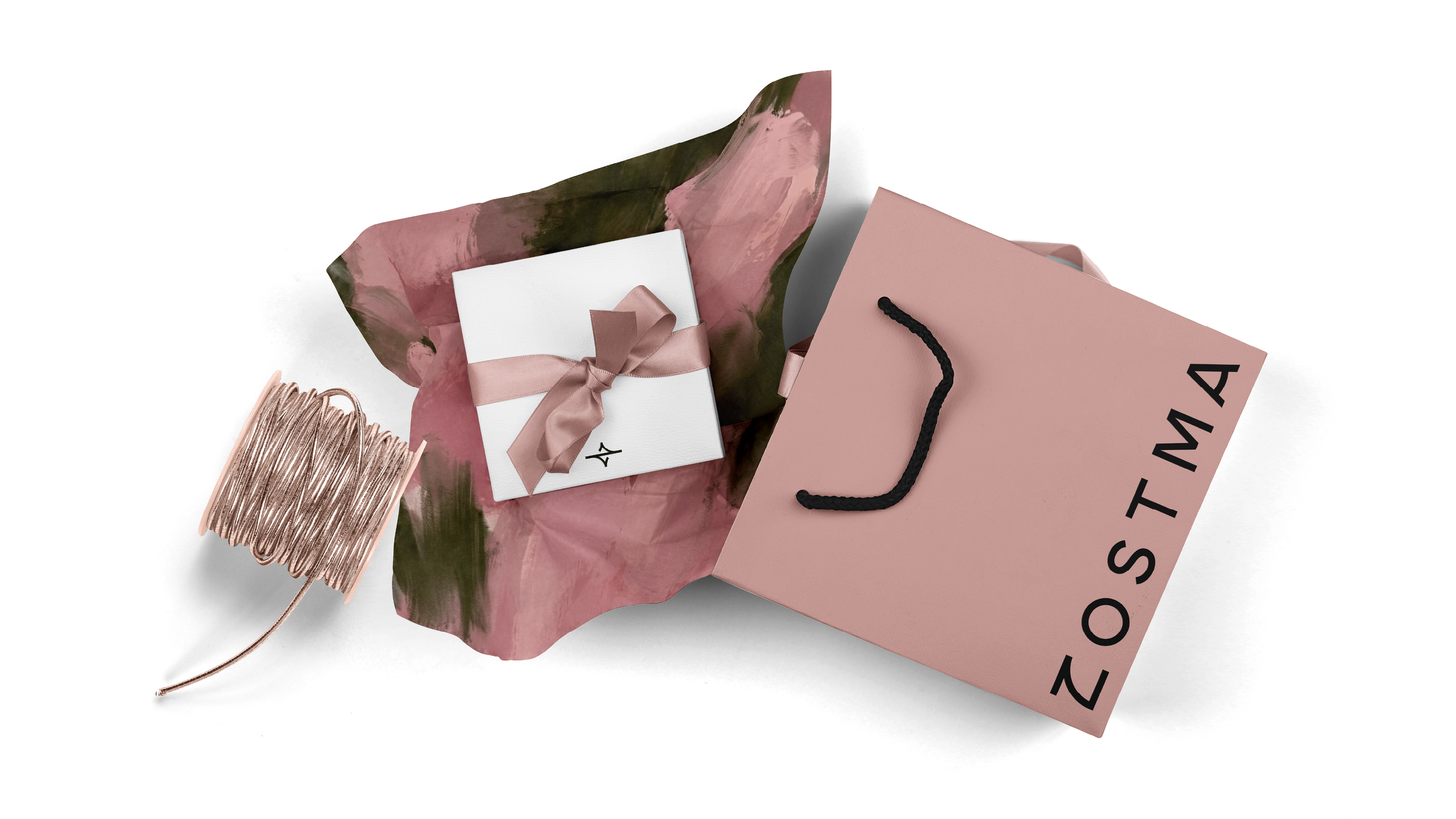
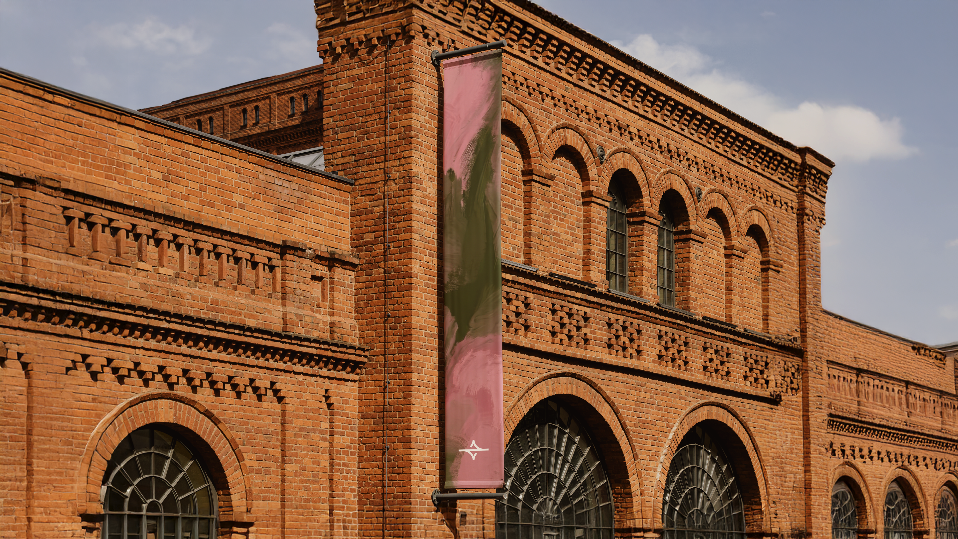
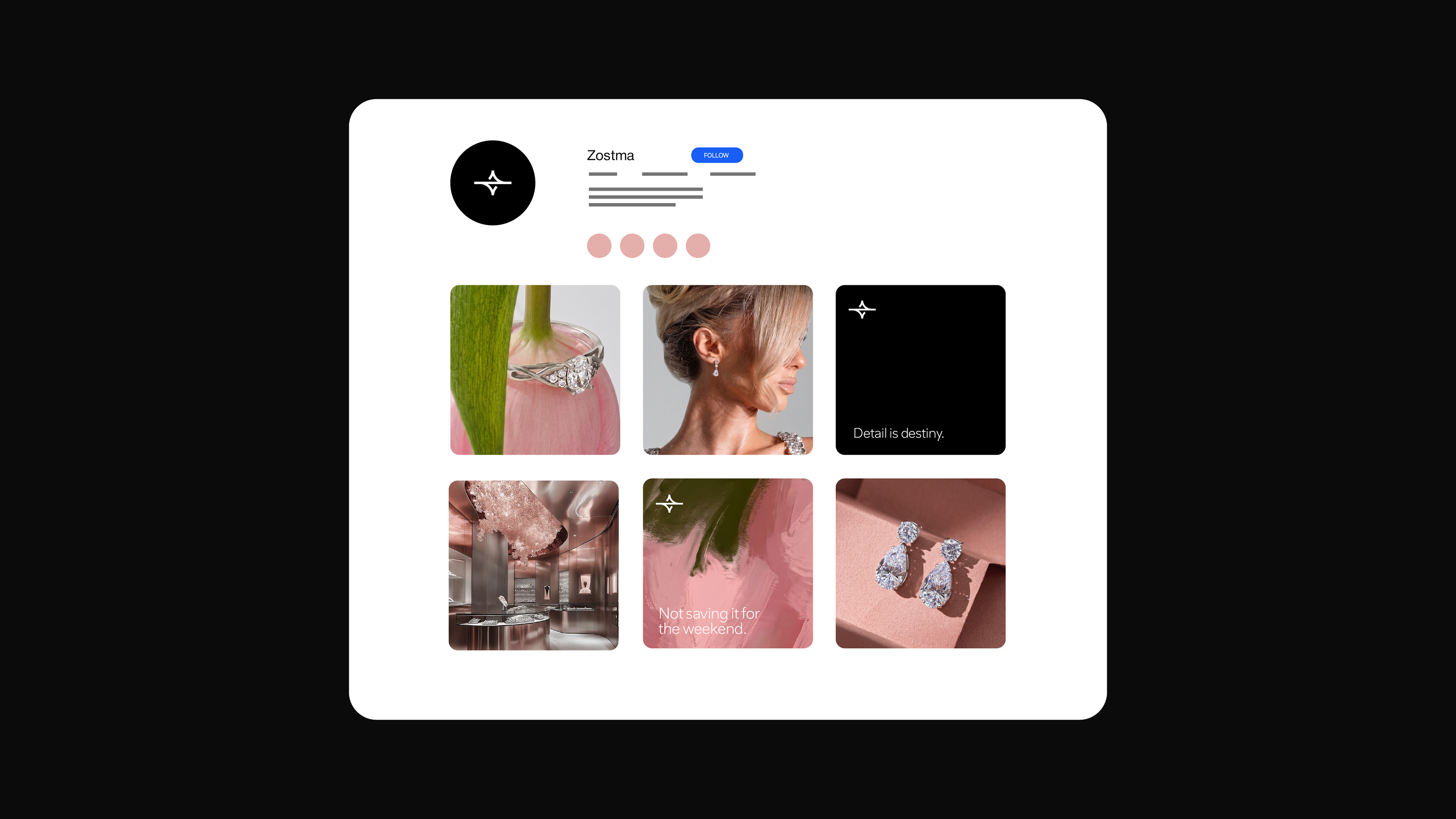
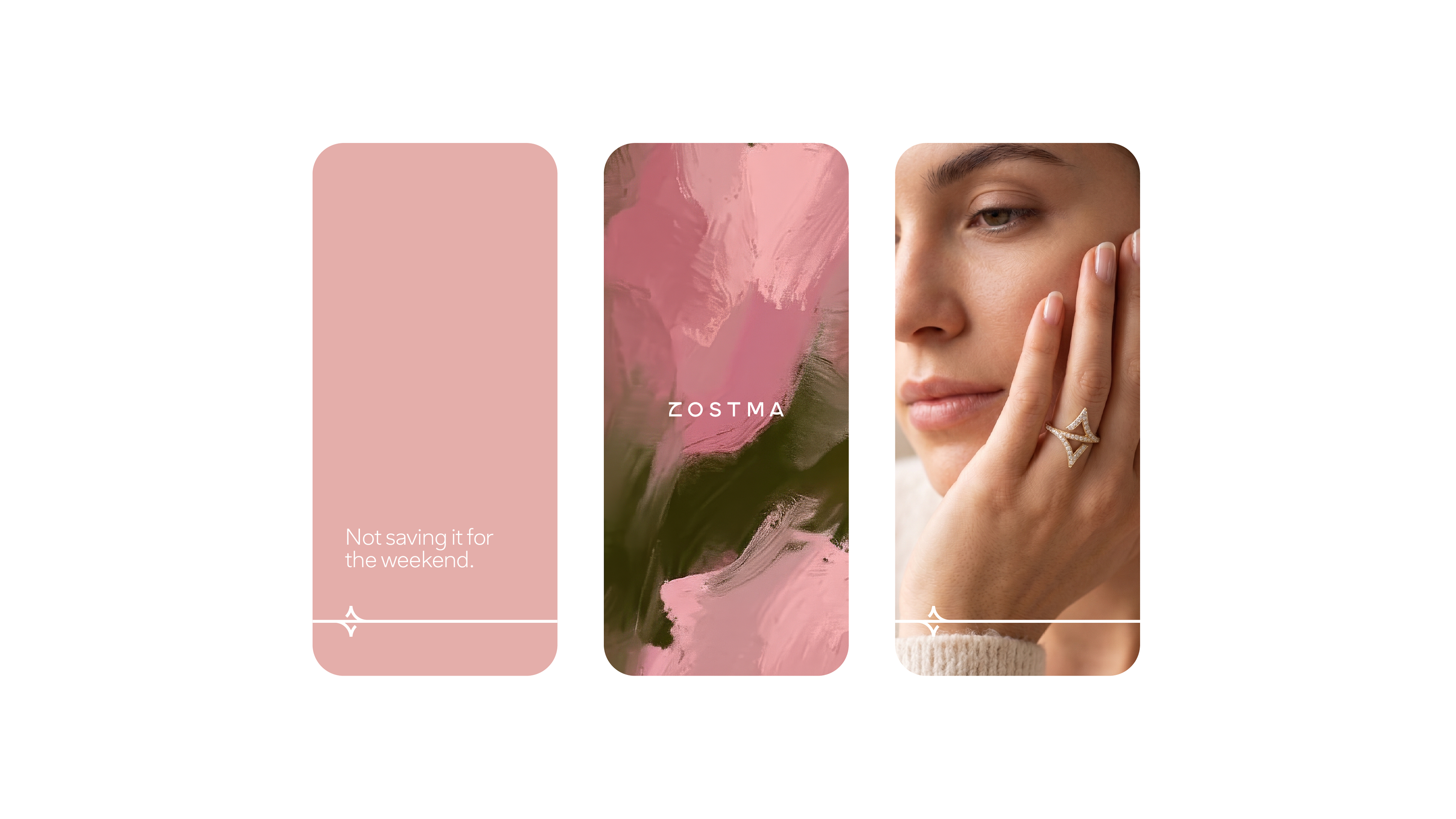
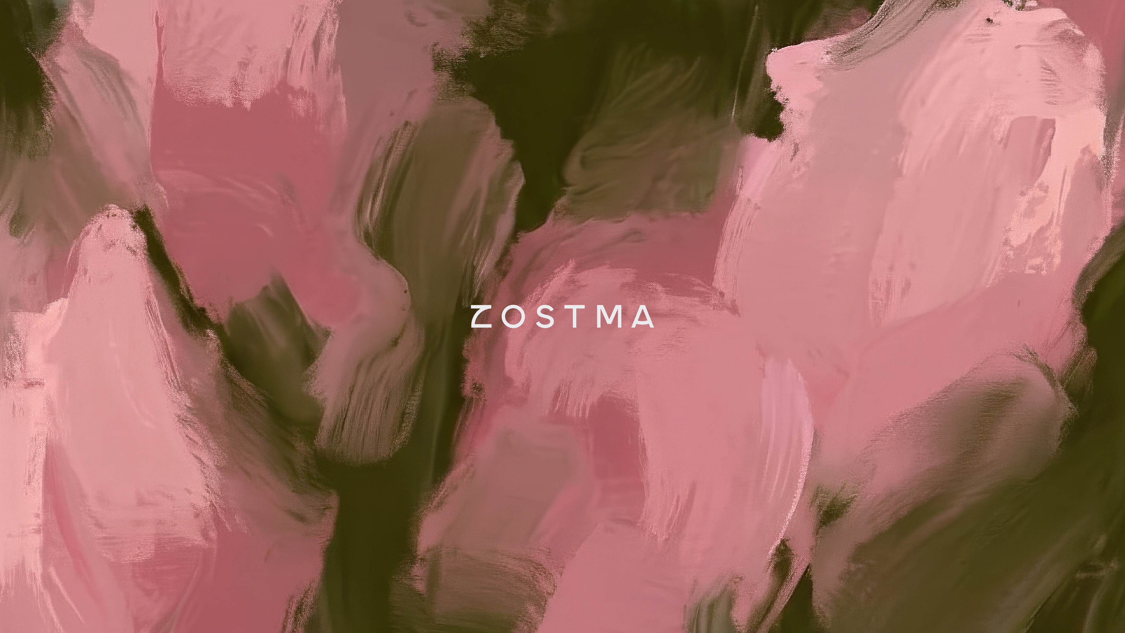
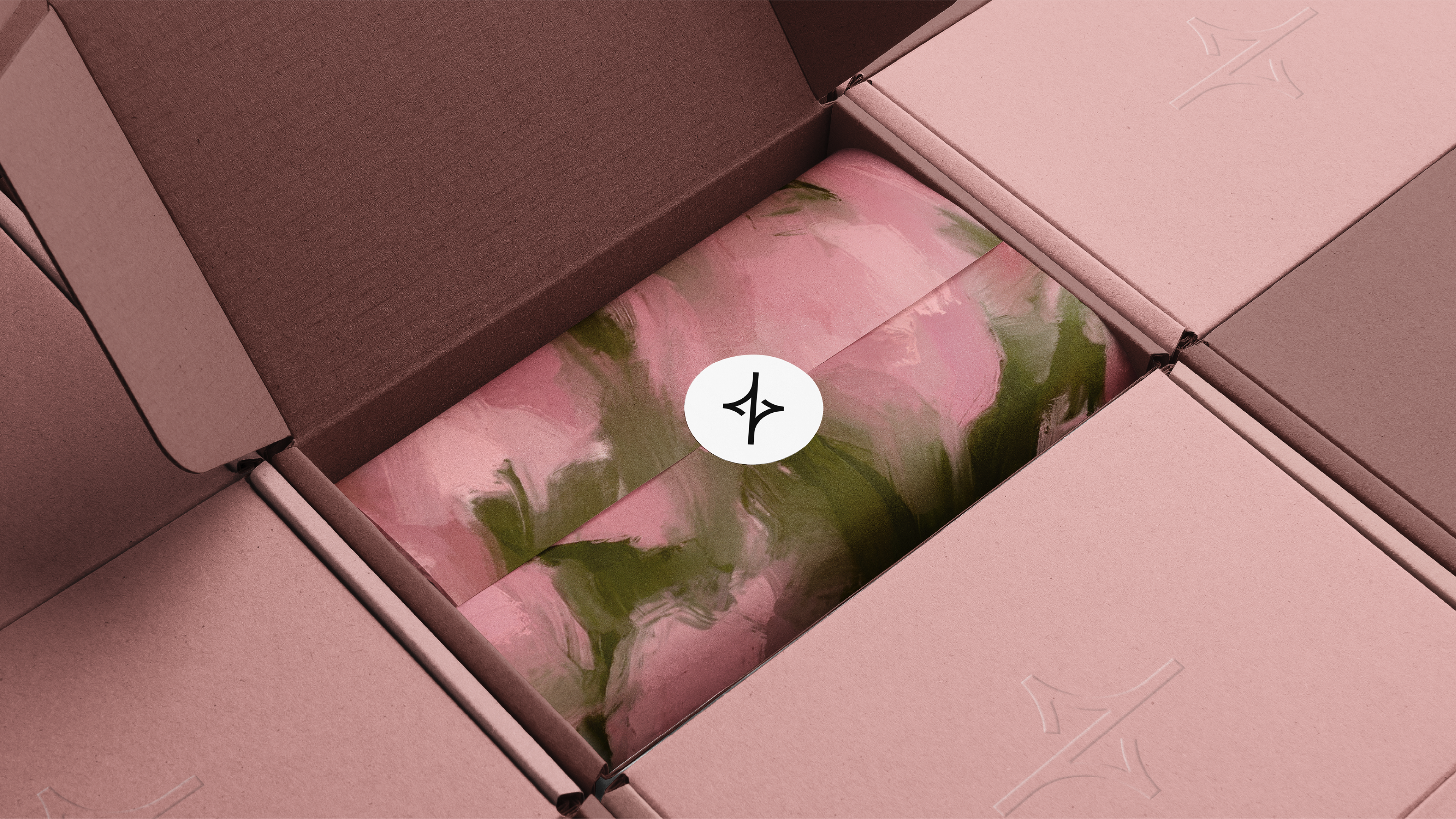
The pattern begins with the tulip — soft, full, unmistakably feminine — and then refuses to draw it. Instead of a literal flower, Zostma renders it in loose oil strokes: blush pinks lifting into white, cut through with deep painterly green. The reference stays legible enough to feel like petals and stems, abstract enough never to become a print of a flower. That restraint is the point. A photographic bloom would read as decoration — pretty, generic, the wallpaper of every feminine brand. A painted gesture reads as authorship: made by a hand, for this brand, owned by no one else.
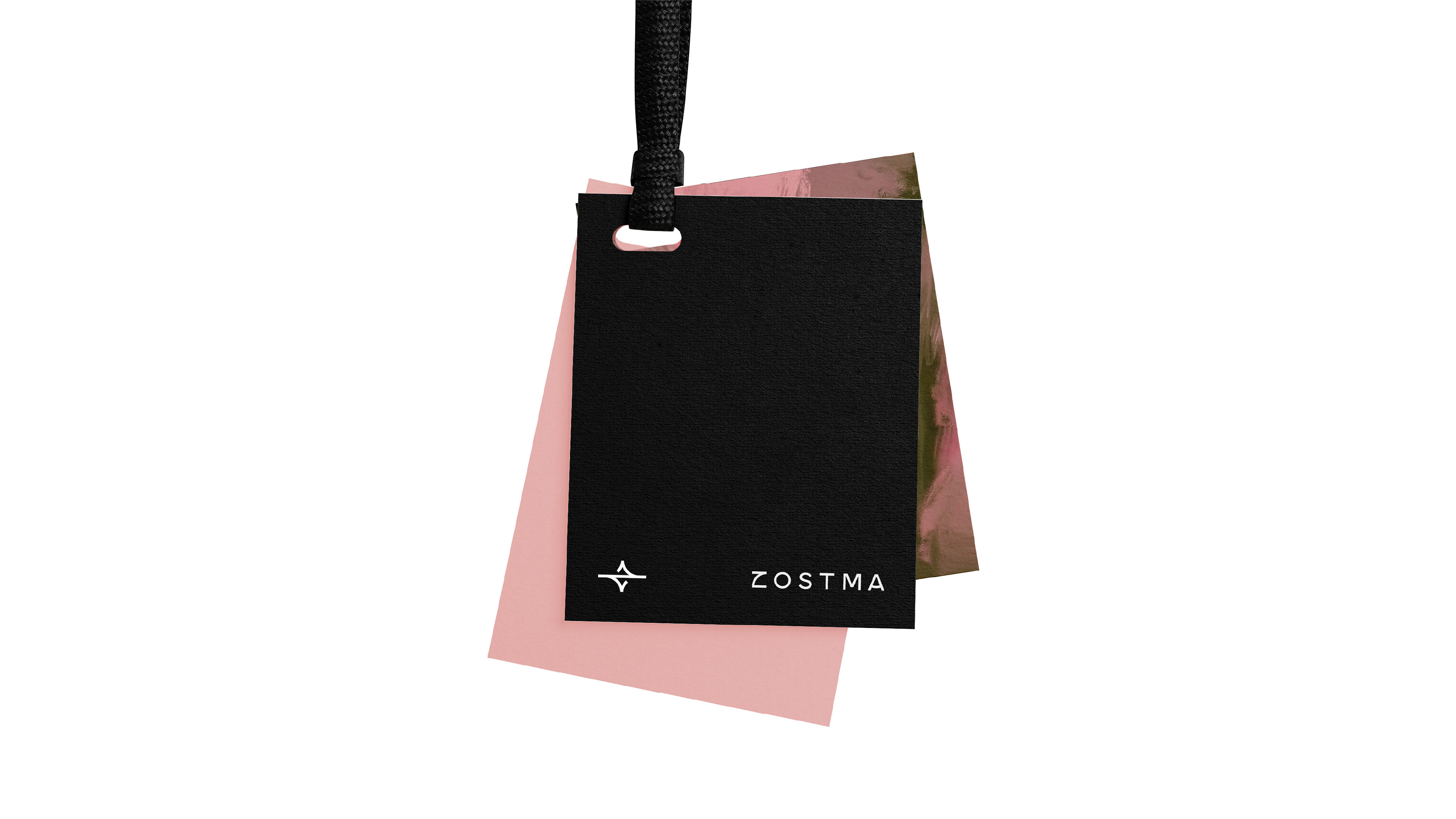
Strategically, the pattern is the system's release valve. Everywhere else the identity is built with a compass — the icon, the wordmark, the grid — precise, structured, engineered. Left alone, that discipline could turn cold. The brushwork is the human warmth that answers it: the same geometric-meets-organic tension the brand keeps everywhere, now expressed as texture rather than line. It also resolves the colour story on a single surface, letting the dusty rose and its deep green move together as paint instead of swatches. And it does real work — wrapping tissue, lining a box, filling a banner, softening a layout — bringing emotion and softness to a structured world the moment a flat colour would feel too austere. Geometry gives the brand its precision. The painting gives it a pulse.